# Flexiboards documentation
> Flexiboards is a headless drag-and-drop toolkit for Svelte 5 and React 18 or 19 where the grid is the model. You get free-form and flow grids, moves between targets, resizing, a keyboard-driven virtual pointer with screen-reader announcements, layouts you can export and import, and server-side rendering with a suspense fallback.
Last generated: 2026-09-13
This file holds the full text of every documentation page, in sidebar order.
---
# Overview
> Install Flexiboards and create a board with movable widgets.
Source: https://www.flexiboards.dev/docs/overview
Build a board with one grid and two widgets. Drag A or B to another cell, or focus a widget and press Enter, use the arrow keys until the preview reaches another cell, and press Enter again to drop it.
## Installation
Start with an existing application in your selected framework. Choose a package manager in the command below; the remaining install commands use that choice.
**Svelte**
```shell
npm install @flexiboards/svelte
```
Use Svelte 5.20 or later in the Svelte 5 release line.
**React**
```shell
npm install @flexiboards/react
```
Use React 18 or 19. Boards also support [server-side rendering](https://www.flexiboards.dev/docs/guides/server-side-rendering).
## Create a board
This example includes its sizing and styles. It needs no CSS framework. Put it in a component and render that component in your application.
**Svelte**
Example: First board
```svelte
A
B
```
**React**
Example: First board
```tsx
import { FlexiBoard, FlexiTarget, FlexiWidget } from '@flexiboards/react';
export function FirstBoard() {
return (
A
B
);
}
```
The target has two columns and two rows, each 100 pixels. Widget positions are zero-based: A starts at column 0, row 0; B starts at column 1, row 1. Set B's `x` to `0` before mounting to start it beneath A.
## Anatomy of a Flexiboard
- `FlexiBoard` owns the interaction state and isolates its targets. Widgets move between targets within one board.
- `FlexiTarget` defines a grid and holds its widgets. Choose a [free-form grid](https://www.flexiboards.dev/docs/free-form-grids) for positions or a [flow grid](https://www.flexiboards.dev/docs/flow-grids) for an ordered collection.
- `FlexiWidget` registers a widget in its target. Pass children for inline content, or use a component to reuse a renderer. See [Widget rendering](https://www.flexiboards.dev/docs/widget-rendering).
A board can contain several targets. In this diagram, one target contains one widget and the other contains two:
Component anatomy: a FlexiBoard contains two FlexiTarget grids side by side. The first target holds one FlexiWidget; the second holds two widgets stacked vertically.
Follow [Multiple targets](https://www.flexiboards.dev/docs/multiple-targets) to build a board with several columns and move widgets between them.
## Example styling
The first board above uses inline CSS. Many later demos use Tailwind utility classes and shadcn theme variables to make widget states visible. Their layout behavior does not require those tools. To reproduce their appearance, configure the [theme setup for your framework](https://www.flexiboards.dev/docs/guides/registry#your-theme-your-source), or replace the utility classes with your own CSS. You do not need to install registry components to use the core board components.
**React**
Examples that import `clsx` also require that package:
```shell
npm install clsx
```
When a guide imports an application component or shows a configuration excerpt, keep the named setup from that guide. Copied registry examples require the installation command on their page.
---
# Configuration
> Learn how to configure Flexiboards components.
Source: https://www.flexiboards.dev/docs/configuration
Boards and targets take a `config` prop; widgets take their configuration as props. Configuration cascades from board to target to widget, and it is reactive, so a board can be locked with one state change:
**Svelte**
Example: Lockable board
```svelte
{editing ? 'Widgets are draggable' : 'Widgets are locked'}
{editing ? 'Widgets are draggable' : 'Widgets are locked'}
OneTwoThree
);
}
```
Every widget picks up `draggability` from the board's `widgetDefaults`, so flipping one value locks them all. The rest of this page explains the cascade and which properties react to changes.
## Cascading configuration
On components that support children, the `config` prop carries a defaults property. Use it to set a default configuration for those children.
The following excerpts replace the opening `FlexiBoard` element in an existing board. Keep your targets and widgets inside it:
**Svelte**
```svelte
```
**React**
```tsx
{/* Existing targets and widgets. */}
```
A target that doesn't specify a layout now uses the one in `targetDefaults`.
The configuration cascades: following the hierarchy of FlexiBoard -> FlexiTarget -> FlexiWidget, the configuration applied is the nearest one that was specified.
For example, say the board's configuration has `widgetDefaults.className = 'a'` and the target's has `widgetDefaults.className = 'b'`.
- If we specify a class on a widget, `c`, then the widget will have class `c` only.
- If we don't specify a class on the widget, then the widget will have class `b`.
- If we don't specify a class on the widget, and we didn't specify `widgetDefaults.className = 'b'` on our widget's parent target, then the widget will have class `a`.
The widget's own configuration wins, and defaults fill in the properties it doesn't specify.
**React**
In React, the class-related properties (`className`, and the `className` inside `widgetDefaults`) are either a string or a function returning a string. Use a helper such as `clsx` to compose conditional classes:
```tsx
import { clsx } from 'clsx';
import type { FlexiWidgetController } from '@flexiboards/react';
const widgetClassName = (widget: FlexiWidgetController) =>
clsx('rounded-lg px-4 py-2', widget.isGrabbed && 'opacity-50');
```
## Reactivity
Flexiboards' configuration system is reactive. If the configuration object you pass to the `config` prop changes, the board picks up the change for a number of the properties on that object.
For example, you can use this system to quickly change whether widgets are draggable on the board.
**Svelte**
In Svelte, pass a configuration object declared with a rune, and mutate it:
```svelte
```
Here, we've set `widgetDefaults.draggability = 'full'` on our board's configuration, so all widgets (that haven't specified their own `draggability` prop) will be fully draggable. To lock the board, set `boardConfig.widgetDefaults.draggability = 'none'`. The board and its widgets update on their own.
**React**
In React, hold the state that drives your configuration in `useState`, and derive the configuration object from it with `useMemo`. Replace the config and any nested objects whose values change. The adapter compares configuration values before updating the board. `useMemo` can keep unchanged configuration stable across renders:
```tsx
import { FlexiBoard } from '@flexiboards/react';
import type { FlexiBoardConfiguration } from '@flexiboards/react';
import { useMemo, useState } from 'react';
export function LockableBoard() {
const [editing, setEditing] = useState(true);
const boardConfig: FlexiBoardConfiguration = useMemo(
() => ({
widgetDefaults: {
draggability: editing ? 'full' : 'none'
}
}),
[editing]
);
return (
<>
{/* Your targets and widgets. */}
);
}
```
Here, all widgets (that haven't specified their own `draggability` prop) are fully draggable while `editing` is true, and locked when it flips to false. Only the properties that actually changed are pushed into the board, so widgets keep any state that was set on their controllers imperatively.
Individual `FlexiWidget` props are reactive in the same way. They're read on every render, so a value derived from component state flows straight through.
Use these boundaries when changing an existing board:
| Configuration | Update behavior |
| -------------------------------------------------------------------------------------------------------------------- | ---------------------------------------------------------------------------------------------------------------------- |
| Widget content, classes, `componentProps`, `metadata`, draggability, resizability, triggers, limits, and transitions | Prop changes update the existing widget. Defaults on the board or target apply where the widget has no explicit value. |
| Widget `id`, `type`, `x`, `y`, `width`, and `height` | Read when the widget is created. Use `moveTo()` for a move; import a layout to replace positions or sizes. |
| Target `layout.type` | Chooses the grid implementation at creation. Recreate the target to switch between free and flow grids. |
| Target identifier | Set when the target is created. Keep it stable so stored layouts still identify the target. |
| `initialLayout` / `initialLayouts` | Seed the initial render. To load another saved layout after mount, call the appropriate controller's `importLayout()`. |
| `loadLayout` / `loadLayouts` | Called during client initialization. Replacing the callback does not request another load. |
Changes to size limits constrain later placements; they do not request an immediate resize. [Controller actions](https://www.flexiboards.dev/docs/controllers#changing-the-board-from-code) run placement rules and report their outcome.
## Deprecated and removed
- `simpleTransitionConfig()` is deprecated and retains its original 150ms easing. Use `cssTransitionConfig()` for the current CSS preset. See [Transitions](https://www.flexiboards.dev/docs/transitions).
Removed in v1.0: the `draggable` boolean (use `draggability`) and `width`/`height` in `widgetDefaults`. See [Migrating to v1.0](https://www.flexiboards.dev/docs/breaking-changes-to-10).
The generated tables on each component's API page also flag deprecated members.
---
# Controllers
> Learn how to manipulate Flexiboard components via their controllers.
Source: https://www.flexiboards.dev/docs/controllers
A controller exposes a board, target, or widget's state and actions. Choose access based on where your code runs:
| Task | Access |
| --------------------------------------------------------- | ------------------------------------------------------------------------------------------------------------- |
| Keep a controller for a parent component's event handlers | `onfirstcreate` |
| Render from a surrounding widget's state | The framework-specific context helper or hook below |
| Set the first layout, including SSR | `initialLayout` in [server-rendering configuration](https://www.flexiboards.dev/docs/guides/server-side-rendering#server-stored-layouts) |
| Replace a layout after initialization | `importLayout()` on a stored controller |
The examples in the access sections are excerpts. Insert your existing targets and widgets where indicated; they focus on how to obtain the controller.
## Method 1: `onfirstcreate` callback
Components with controllers accept `onfirstcreate`. The callback receives the controller once. Use it to keep a reference for later actions. Timing depends on the adapter, as described below.
**Svelte**
```svelte
```
The callback runs during component setup, including SSR. Keep browser-only work in client event handlers or effects. Use `initialLayout` for data that must appear in the server-rendered board.
**React**
```tsx
import { FlexiBoard } from '@flexiboards/react';
import type { FlexiBoardController } from '@flexiboards/react';
import { useRef } from 'react';
export function MyBoard() {
const boardRef = useRef(null);
return (
{
boardRef.current = controller;
// do something with the board!
}}
>
{/* ... */}
);
}
```
Stashing the controller in a ref, as above, is how you hold an imperative handle on a board in React. The callback fires once, from a layout effect after the component's first commit, so before anything is painted. The rest of your component then reaches the board through the ref.
Because it fires after commit, the callback may also call `setState`. Hold the controller in state and pass it to `useReactive()` when the _parent_ needs to render from the controller's own state. `useReactive` accepts a controller that doesn't exist yet and returns a reactive proxy once it does, exactly like the hooks described below:
```tsx
import { FlexiBoard, useReactive } from '@flexiboards/react';
import type { FlexiBoardController } from '@flexiboards/react';
import { useState } from 'react';
export function MyBoard() {
const [controller, setController] = useState();
const board = useReactive(controller);
return (
<>
{board?.currentWidgetAction ? 'Moving a widget…' : 'Idle'}
{/* ... */}
);
}
```
For anything rendered _inside_ the board, the hooks below are simpler.
**Svelte**
## Method 2: `bind:controller` prop
Bind `controller` to a state variable when the parent needs the instance. Guard reads before initialization.
Here's an example of using it to access the controller of a `FlexiBoard`:
```svelte
```
The button handler runs on the client after initialization. For setup-time controller access, use `onfirstcreate`; for server-provided layout data, use `initialLayout`.
By the time the `onfirstcreate` callback fires, any variable bound to `controller` already holds the controller instance. If you prefer, you can read that variable rather than the `controller` parameter passed to the callback.
## Method 3: context helper
From any component rendered _inside_ a Flexiboards component, you can reach the surrounding widget's controller through the `getFlexiwidgetCtx()` helper. It uses the [Svelte Context API](https://svelte.dev/docs/svelte/context) under the hood, so it must be called from the top level of a component.
```svelte
...
```
**React**
## Method 2: context hooks
Call these hooks from a component rendered inside the corresponding Flexiboards component:
- `useFlexiBoard()` returns the enclosing `FlexiBoard` controller
- `useFlexiTarget()` returns the enclosing `FlexiTarget` controller
- `useFlexiWidget()` returns the enclosing `FlexiWidget` controller
- `useFlexiAdd()` returns the enclosing `FlexiAdd` controller
- `useResponsiveFlexiBoard()` returns the enclosing `ResponsiveFlexiBoard` controller
Each hook throws if you call it outside of the relevant component, so you get either a controller or a clear error.
```tsx
// my-widget-content.tsx
import { useFlexiWidget } from '@flexiboards/react';
export function MyWidgetContent() {
const widget = useFlexiWidget();
return
...
;
}
```
The controllers returned by these hooks are **reactive proxies**. Any signal-backed getter you read while rendering is tracked, including `widget.isGrabbed`, `widget.draggability`, `widget.x` and `target.dropRejected`, and your component re-renders when it changes. Read the property during render to subscribe to it.
Controller collections are tracked too: reading `target.widgets.size`, iterating `target.widgets`, or reading a reactive map subscribes to changes in that collection. Tracking is otherwise shallow; replace metadata objects through the controller setter when updating them.
Reads in event handlers, effects, and callbacks do not subscribe the component to updates. For example, this button reads the layout only when pressed:
```tsx
import { useFlexiBoard } from '@flexiboards/react';
export function ExportButton() {
const board = useFlexiBoard();
return ;
}
```
## Changing the board from code
Once you hold a controller you can change the board without a drag. Placement actions run the grid rules. Successful layout mutations notify `onLayoutChange`; import and export have separate behavior shown below.
| Call | What it does |
| ------------------------------ | ----------------------------------------------------------------------------------------------------------------------------------- |
| `widget.delete()` | Removes the widget from its target. Fires `onWidgetDelete`. |
| `widget.moveTo({ x, y })` | Moves the widget within its target. Returns `false` and leaves it in place if the grid refuses the spot. |
| `widget.moveTo({ target })` | Moves the widget to another target, wherever that target's grid puts it. Pass `x` and `y` too to choose the cell. |
| `target.createWidget(config)` | Adds a widget. Returns `undefined` if it cannot be placed. |
| `target.clear()` | Deletes every widget in the target. |
| `board.clear()` | Deletes every widget in every target. |
| `board.importLayout(layout)` | Replaces widgets in targets named by the saved layout, bare or in a `{ version, layout }` envelope. Does not fire `onLayoutChange`. |
| `board.exportLayoutEnvelope()` | The layout with its format version, the shape to persist. See [Exporting & Importing](https://www.flexiboards.dev/docs/guides/exporting-importing-boards). |
This excerpt assumes `done` and `doing` are target controllers from the same board:
```ts
// Move the first "done" card back into "doing", at the top.
const card = done.widgets.values().next().value;
card?.moveTo({ target: doing, x: 0, y: 0 });
```
`moveTo` bypasses `canDrop`. Validate application permissions before calling it; grid placement rules still apply. A refused move returns `false`. A successful placement notifies even if the coordinates are unchanged. Clears notify only if widgets are removed.
## Reacting to interactions
Use `canDrop` for validation, grab and enter/leave callbacks for interaction progress, and drop/resize callbacks for committed changes. `onLayoutChange` reports the committed layout in a batched microtask before animations settle.
These configuration excerpts log accepted moves between targets and deletions. Keep your existing target declarations inside the board:
**Svelte**
```svelte
```
**React**
```tsx
import { FlexiBoard, type FlexiBoardConfiguration } from '@flexiboards/react';
const config: FlexiBoardConfiguration = {
onWidgetDrop: ({ widget, sourceTarget, target }) => {
if (sourceTarget !== target) {
console.info('Moved', widget.userProvidedId ?? widget.id, 'to', target.key);
}
},
onWidgetDelete: ({ widget }) => console.info('Deleted', widget.userProvidedId ?? widget.id),
// Only the "done" column accepts cards that are marked complete.
canDrop: ({ widget, target }) => target.key !== 'done' || widget.metadata?.complete === true
};
export function Board() {
return {/* Existing targets and widgets. */};
}
```
Stable configs avoid unnecessary comparisons. Inline objects work too: the adapter compares their values before updating the board. Replace nested configuration objects when changing them rather than mutating them in place.
| Callback | Fires when |
| -------------------------------------------- | ------------------------------------------------------------------------------------------------------------------------------------------------------------------------------------ |
| `onWidgetGrab` | The user picks a widget up, by pointer or keyboard. |
| `onWidgetDrop` | A move commits, before its animation settles. `sourceTarget` is where it came from; it is `undefined` for a widget that arrived through a `FlexiAdd`. |
| `onWidgetCancel` | The user presses Escape, or lets go where nothing accepts the widget. The widget is back where it started. |
| `onWidgetDelete` | A widget is dropped on a `FlexiDelete`, or `widget.delete()` is called. |
| `onWidgetResize` | A resize the user was making commits. |
| `onWidgetEnterTarget`, `onWidgetLeaveTarget` | A widget being moved is carried over a target, or leaves it. Useful for styling a column while it is the candidate. |
| `canDrop` | While the user hovers and again on release. Return `false` to refuse; the drop preview shows the rejection and the widget returns to its origin. |
| `onLayoutChange` | Accepted drops/resizes and programmatic creation, movement, or deletion. Batched in a microtask with committed coordinates. Hover, validation, import, and export do not trigger it. |
`canDrop` runs alongside the grid's own rules (bounds, collisions, size limits), which apply whether or not you provide it. A target's own configuration can carry a `canDrop` too, for rules that belong to one list rather than the board; both must agree.
## Controller APIs
Each controller's properties and methods are listed on its component's page: [FlexiBoard](https://www.flexiboards.dev/docs/components/board#flexiboardcontroller), [FlexiTarget](https://www.flexiboards.dev/docs/components/target#flexitargetcontroller), and [FlexiWidget](https://www.flexiboards.dev/docs/components/widget#flexiwidgetcontroller).
---
# Accessibility
> What Flexiboards does for keyboard and screen-reader users, and what your markup needs to add.
Source: https://www.flexiboards.dev/docs/accessibility
## What the library provides
Flexiboards renders semantic roles and live announcements without any configuration:
- The board is a `role="application"` region, described by a hidden instructions element and marked `aria-busy` while a layout is [pending](https://www.flexiboards.dev/docs/guides/server-side-rendering).
- Each target's grid is `role="grid"` with `aria-colcount` and `aria-rowcount`.
- Each placed widget is a `role="gridcell"` owned by a `role="row"`. Row and column indices start at 1; spans describe the widget's size. Controller coordinates and stored layouts still start at 0. Rows use `aria-owns` so moving a widget does not remount its content within a target.
- A held widget temporarily becomes a `role="group"` without grid coordinates. Its decorative preview is hidden from assistive technology and cannot receive focus. Empty targets expose an "Empty drop target" cell.
- `data-flexi-widget` identifies rendered widgets in every interaction state. The legacy `aria-grabbed` and `aria-dropeffect` attributes remain for compatibility; live announcements communicate the actions.
- A visually hidden `aria-live` announcer inside the board reports grabs, resizes, releases, and rejected drops.
## Keyboard
A widget that can be grabbed is in the tab order. If it contains a [FlexiGrab](https://www.flexiboards.dev/docs/components/grab), the handle takes its place in the tab order instead, and [FlexiResize](https://www.flexiboards.dev/docs/components/resize) handles are buttons in the tab order when resizing is enabled. A disabled resize handle is skipped.
| Key | On | Effect |
| --------------------------------------------------- | ----------------------------------- | -------------------------------------------------------------------------------------------------------------------------------------------------- |
| `Tab` | Page | Moves focus between widgets, grab handles, resize handles, and adders. |
| `Enter` | Focused widget or grab handle | Grabs the widget from its centre. |
| `Enter` | Focused resize handle | Starts resizing the widget. |
| `Enter` | Focused adder | Creates the adder's widget and grabs it. |
| `←` `→` `↑` `↓` | While grabbed or resizing | Moves the widget, or its resize edge, by a small step. Hold `Shift` for a large step, or `Ctrl` / `Cmd` for a fine one. |
| `Enter` | Anywhere, while grabbed or resizing | Drops the widget where it currently is. |
| `Escape` | Anywhere, while grabbed or resizing | Cancels and returns the widget to where it started. |
A keyboard grab drives the same virtual pointer as a mouse drag, so the widget follows the arrow keys across cells and between targets exactly as it would follow a cursor. `Tab` is trapped while a widget is held, so focus cannot leave until you drop or cancel.
## What you need to add
- **Label handles and adders.** `FlexiGrab`, `FlexiResize`, `FlexiAdd`, and `FlexiDelete` render their own elements but not their own text. Put a visually hidden `span` inside icon-only content.
- **Make state visible.** The `isGrabbed`, `isShadow`, `isResizing`, and `dropRejected` flags on the widget controller are yours to style; the library only announces them. See [Widget Rendering](https://www.flexiboards.dev/docs/widget-rendering#styling-by-state).
- **Respect reduced motion.** Flexiboards transitions move and resize widgets, which is the kind of motion `prefers-reduced-motion` asks you to remove. When it is set, leave `transition` out of the configuration so widgets snap into place. Opacity and colour changes in your own widget styling can stay; the preference is about movement, not every animation.
- **Keep custom content operable.** Buttons and links inside a widget keep working while the widget is draggable, but on touch devices a full-widget drag competes with scrolling. Prefer a grab handle, or the `longPressTriggerConfig()` grab trigger, where widgets contain interactive content.
## Verify accessibility
Run keyboard checks against your own widget content: grab, move, resize, drop, cancel, and Tab out after the action. Check that focus stays on the active control, that disabled handles are skipped, and that activating a nested button does not grab its widget.
This repository runs adapter unit tests, axe-core checks in Playwright, and browser accessibility-tree assertions. The browser suite exercises both frameworks, including cross-target keyboard drops. Run it with `pnpm -C site e2e accessibility.spec.ts` after building the packages.
Automated checks cover markup and interaction regressions. Test your application with a screen reader too, particularly nested boards, custom controls, and the wording of announcements. Follow the [WAI-ARIA grid and table guidance](https://www.w3.org/WAI/ARIA/apg/practices/grid-and-table-properties/) when inspecting positions and spans.
---
# Docs for LLMs
> Give an AI assistant the Flexiboards docs as plain Markdown.
Source: https://www.flexiboards.dev/docs/llms
These docs follow the [llms.txt convention](https://llmstxt.org), so an assistant can read them without scraping HTML. Every page on this site also has a Markdown twin.
## Files
| File | What it holds |
| -------------------------------- | ------------------------------------------------------------------------------------------------------------------------------- |
| [/llms.txt](https://www.flexiboards.dev/llms.txt) | An index of every docs page with a one-line description, plus the examples and the npm packages. Point an assistant here first. |
| [/llms-full.txt](https://www.flexiboards.dev/llms-full.txt) | The full text of every docs page in one file, for tools that want everything in context at once. |
| `/docs/.md` | Any docs page as Markdown, at the page's own URL with `.md` appended. [/docs/flow-grids.md](https://www.flexiboards.dev/docs/flow-grids.md), for example. |
## Choose a framework
Markdown accepts a `framework` query parameter. It selects the examples, framework-specific prose, prop names, and API tables. Shared explanations appear once.
**Svelte**
- [One page](https://www.flexiboards.dev/docs/flow-grids.md?framework=svelte): `/docs/flow-grids.md?framework=svelte`
- [Full docs](https://www.flexiboards.dev/llms-full.txt?framework=svelte): `/llms-full.txt?framework=svelte`
**React**
- [One page](https://www.flexiboards.dev/docs/flow-grids.md?framework=react): `/docs/flow-grids.md?framework=react`
- [Full docs](https://www.flexiboards.dev/llms-full.txt?framework=react): `/llms-full.txt?framework=react`
Omit the query or use `?framework=all` for both frameworks, useful when comparing adapters. These URLs are independent of cookies, so sharing a link always shares the same version. Framework-only migration pages are omitted from the other framework's full docs and return 404 when explicitly requested for it.
Each HTML page advertises the selected version with ``, so tools can discover the appropriate plain-text URL.
## Copy a page
Every docs page has a **Copy as Markdown** action under its title, next to the edit link. It copies only the currently selected framework's documentation. **Open Markdown** opens that same version in a new tab. Both actions follow the framework picker automatically.
---
# Changelog
> What changed in each release of Flexiboards, newest first.
Source: https://www.flexiboards.dev/docs/changelog
Dates are the npm publish dates. Breaking changes link to their migration page.
## 1.0.0 (2026-09-13)
The first release of the split packages: `@flexiboards/core` holds the grid engine, `@flexiboards/svelte` and `@flexiboards/react` are adapters over it with mirrored APIs. `svelte-flexiboards` stops at 0.4.2. See [Migrating to v1.0](https://www.flexiboards.dev/docs/breaking-changes-to-10).
Added
- React adapter with the same components, hooks in place of context getters, `onfirstcreate` in place of `bind:controller`, a `suspense` prop, and `renderToString` support. `FlexiBoard` forwards `ref` to its root element.
- Controller actions: `widget.delete()`, `widget.moveTo()`, `target.clear()`, `board.clear()`, `exportLayoutEnvelope()`. `onLayoutChange` reports layout mutations; exporting an envelope only reads the layout.
- Board callbacks `onWidgetGrab`, `onWidgetDrop`, `onWidgetResize`, `onWidgetCancel`, `onWidgetDelete`, `onWidgetEnterTarget`, `onWidgetLeaveTarget`, and `canDrop` on the board and on each target.
- Presets `FlexiSortable` and `FlexiDashboard`.
- `FlexiWidget` declarations can mount after their target has loaded, using the same placement rules as `createWidget()`.
- CSS motion uses sine in-out reordering and circ-out drops. The deprecated `simpleTransitionConfig()` keeps its original 150ms timing. Registry component families enable transitions by default and respect reduced motion.
- Animation adapters: `cssTransition()` and `spring()`, with `cssTransitionConfig()` and `springTransitionConfig()`.
- Layout callbacks run after a drop is committed, before animations settle. Destination placeholders use the final card size, including when text wraps differently between columns.
- The spring preset responds faster with less bounce. Core springs follow the same path across frame rates, including at 30fps.
- Sortable-style insert resolution for flow grids, and `portalDropFlights` for boards that need a drop to fly in across their edge.
- `dropRejected` state on targets and widgets; `initialLayout` for server-provided layouts; layouts loaded on the client can show a `suspense` fallback.
- Every exported layout entry carries an `id`; layouts can be stored as a `{ version, layout }` envelope.
- `FlexiGrab` and `FlexiResize` components; class functions on both.
- Markdown twins of every docs page and `/llms.txt`.
Fixed
- Grid cells now belong to rows and expose one-based ARIA indices. Drag previews are hidden and inert, and keyboard focus is preserved across targets.
- React StrictMode could disconnect the live announcer from the board. Nested button activation no longer grabs the surrounding widget.
- A drop's flight aimed at where its slot used to be before the grid reflowed, and, in nested boards, started from the wrong place.
- A flow column kept an empty row after a card was dragged out of it.
- A keyboard grab that jumped the pointer into another target never got a drop preview there.
- Widgets with `draggability: 'none'` were still focusable and marked droppable.
- Target sizing changes made after mount did not restyle the grid.
Removed
- The `draggable` boolean and the `width`/`height` keys of `widgetDefaults`.
## 0.4.2 (2026-06-10)
- Text inside widgets can be selected again: pointer events are no longer prevented unconditionally.
- Drag behaviour fixes and a tidier boundary between internal and public controllers.
## 0.4.1 (2026-04-06)
- Widget positions were tracked incorrectly while the board was scrolled, during both grabs and resizes.
- The "View source" links on the examples now point at the examples folder.
## 0.4.0 (2026-02-07)
See [Breaking Changes in v0.4](https://www.flexiboards.dev/docs/breaking-changes-to-04).
- Layout import and export, and `ResponsiveFlexiBoard` with per-breakpoint layouts.
- Scrollable boards, with scrollbar compensation during drags so the layout does not shift.
- Resizing on flow grids, and improved placement logic for them.
- Interpolation fixes for shrinking and resizing widgets.
- The products example.
## 0.3.2 (2025-09-01)
See [Breaking Changes in v0.3](https://www.flexiboards.dev/docs/breaking-changes-to-03). The last release of the 0.3 line.
---
# Migrating to v1.0
> What changed in Flexiboards 1.0, and how to move a v0.4 project across.
Source: https://www.flexiboards.dev/docs/breaking-changes-to-10
_Migrating from v0.3 or earlier? Apply [v0.4](https://www.flexiboards.dev/docs/breaking-changes-to-04) first._
## What changed and why
Flexiboards 1.0 moves the Svelte library to `@flexiboards/svelte` and its shared engine to `@flexiboards/core`. Svelte projects must update the package name, replace removed props, and handle untyped exported entries. The sections below list the required changes.
## Renamed packages
| v0.4 | v1.0 |
| -------------------- | -------------------------------------------------------------------- |
| `svelte-flexiboards` | `@flexiboards/svelte` |
| Not in v0.4 | `@flexiboards/core` (types and helpers, re-exported by each adapter) |
```shell
npm uninstall svelte-flexiboards
npm install @flexiboards/svelte
```
Then replace the import specifier:
```diff
- import { FlexiBoard, FlexiTarget, FlexiWidget } from 'svelte-flexiboards';
+ import { FlexiBoard, FlexiTarget, FlexiWidget } from '@flexiboards/svelte';
```
Every export from v0.4 is still exported from `@flexiboards/svelte` under the same name.
## Accessibility selectors and coordinates
Replace `[role="cell"]` selectors with `[data-flexi-widget]` when styling or finding widgets in every interaction state. Placed widgets now use `role="gridcell"` inside accessible rows; a held widget temporarily uses `role="group"`.
`aria-colindex` and `aria-rowindex` start at 1. Controller coordinates and stored layouts remain zero-based. For example, `x: 0, y: 0` is exposed as column 1, row 1. Update tests that read these attributes directly; `cellAt(0, 0)` still finds the first model cell.
## Changed helpers
| v0.4 | v1.0 | Notes |
| -------------------------- | ----------------------- | ------------------------------------------------------------------- |
| `simpleTransitionConfig()` | `cssTransitionConfig()` | The old helper is deprecated and retains its original 150ms easing. |
## Deprecations still honoured
- `simpleTransitionConfig()` retains the original 150ms preset. `cssTransitionConfig()` now uses sine in-out moves and circ-out drops.
## Removed
- `draggable` on widgets and in `widgetDefaults`, deprecated since v0.4. Use `draggability`: `'full'` for `true`, `'none'` for `false`, or `'movable'` for a widget other widgets may push but the user cannot grab. The controller's `draggable` getter stays, read-only, as shorthand for `draggability !== 'none'`.
- `width` and `height` in `widgetDefaults`. They never had an effect, so nothing changes at runtime; if you set them, TypeScript now flags the keys. Set `width` and `height` on each widget instead.
## The `svelte-flexiboards` package
`svelte-flexiboards` stops at 0.4.2. It stays on npm and keeps working, but it receives no further releases; every fix and feature from here lands in `@flexiboards/svelte`.
## New in v1.0
### Controller actions and interaction callbacks
You can change a board from its controllers:
- Call `delete()` or `moveTo()` on a widget.
- Call `clear()` on a target or board.
`onLayoutChange` now also reports changes made through these methods and `createWidget()`. It runs in a microtask before animations settle, batching changes made in the same turn. Debounce your save handler if you need to limit writes to storage.
The board configuration adds callbacks for each interaction:
- `onWidgetGrab`, `onWidgetDrop`, and `onWidgetCancel` track a drag.
- `onWidgetResize` reports a committed resize; `onWidgetDelete` reports a deletion.
- `onWidgetEnterTarget` and `onWidgetLeaveTarget` track movement between targets.
Use `canDrop` on the board or an individual target to reject a placement. See [Controllers](https://www.flexiboards.dev/docs/controllers#changing-the-board-from-code).
### Layout exports
- Every exported widget has an `id`.
- `exportLayoutEnvelope()` includes a format version alongside the layout for storage.
- Widgets without a `type` are now included in exports. `FlexiWidgetLayoutEntry.type` is optional, so code that reads it must handle `undefined`.
### Component behavior
In Svelte, you can mount new `FlexiWidget` declarations after the target has loaded. Each one is added through the existing placement rules. A placement that cannot fit is rejected with a warning. See [Adding widgets later](https://www.flexiboards.dev/docs/components/widget#adding-widgets-later).
### Other additions
- `springTransitionConfig()`, and the `spring()` and `cssTransition()` animation adapters. See [Transitions](https://www.flexiboards.dev/docs/transitions).
- `initialLayout` and the `suspense` snippet for server-rendered boards. See [Server-Side Rendering](https://www.flexiboards.dev/docs/guides/server-side-rendering).
- `packing` on free-form layouts. See [Free-Form Grids](https://www.flexiboards.dev/docs/free-form-grids).
- `dropRejected` on widget and target controllers. See [Widget Rendering](https://www.flexiboards.dev/docs/widget-rendering#styling-by-state).
---
# Breaking changes in v0.4
> The breaking changes in the v0.4 update.
Source: https://www.flexiboards.dev/docs/breaking-changes-to-04
_Applies to `svelte-flexiboards` v0.4.0, released 7 February 2026. This page is kept for reference; new projects should install `@flexiboards/svelte` and follow [Migrating to v1.0](https://www.flexiboards.dev/docs/breaking-changes-to-10)._
## 1. Draggability
In place of the `draggable` boolean property, we've introduced a `draggability` enum (values `none`, `movable`, `full`) for finer control over widget movability.
- `none` is equivalent to `draggable = false`. The widget is completely fixed in place.
- `full` is equivalent to `draggable = true`. The widget can be grabbed by the user and moved by other widget actions.
- `movable` is a new value. You cannot grab a widget and move it yourself, but other widget actions can still move it.
In v0.4, `draggable` is deprecated. It was removed in v1.0; use `draggability` when [migrating to v1.0](https://www.flexiboards.dev/docs/breaking-changes-to-10#removed).
## 2. Widget defaults
We're removing the `width` and `height` properties from `FlexiWidgetDefaults`. These properties have never functioned, and we have not found a use-case worth making them work for.
In v0.4, `width` and `height` on `widgetDefaults` are deprecated. They were removed in v1.0. Set dimensions on individual widgets.
---
# Presets
> Start with a sortable list or a dashboard grid in three lines, then graduate to the full components when you need more.
Source: https://www.flexiboards.dev/docs/presets
Two presets cover the boards people most often ask for. Each is one `FlexiBoard` wrapped around one `FlexiTarget` with the layout already chosen, so the first board you write has nothing to configure. Everything a board or target accepts still reaches them through `config` and `targetConfig`.
## Sortable list
**Svelte**
Example: Sortable list
```svelte
Write the docsRecord the demoShip it
```
**React**
Example: Sortable list
```tsx
import { FlexiSortable, FlexiWidget } from '@flexiboards/react';
export function SortableList() {
return (
Write the docsRecord the demoShip it
);
}
```
`FlexiSortable` is a flow grid with one column (`direction="vertical"`, the default) or one row (`direction="horizontal"`). Items pack together and keep their order; drag one onto another and they swap. Widgets are fully draggable unless `config.widgetDefaults` says otherwise.
**Props (Svelte)**
| Name | Type | Description |
| --- | --- | --- |
| `controller` (bindable) | `FlexiBoardController \| undefined` | Optional. The controller managing this component's state and behaviour. Bind to it to access the component's imperative API. |
| `onfirstcreate` | `((instance: FlexiBoardController) => void) \| undefined` | Optional. Fires when the component's controller is first created. |
| `direction` | `'vertical' \| 'horizontal'` | Optional. Which way the list runs. Vertical is a column of rows, horizontal a row of columns. Default: `'vertical'`. |
| `key` | `string` | Optional. The target key, used when a layout is exported or imported. Default: `'list'`. |
| `class` | `string` | Optional. Classes for the list's grid element (the place for `gap-*`). |
| `containerClass` | `string` | Optional. Classes for the element wrapping the grid. |
| `boardClass` | `ClassValue` | Optional. Classes for the board's root element. |
| `config` | `FlexiBoardConfiguration` | Optional. Board configuration merged over the preset's defaults, which make widgets fully draggable. Anything a FlexiBoard accepts: callbacks, registry, layouts. |
| `targetConfig` | `Omit, 'layout'>` | Optional. Target configuration merged over the preset's. `direction` fixes the layout, and sizing and widget defaults are yours to set. |
| `children` | `Snippet` | Optional. The list items: FlexiWidget declarations. |
**Props (React)**
| Name | Type | Description |
| --- | --- | --- |
| `onfirstcreate` | `((instance: FlexiBoardController) => void) \| undefined` | Optional. Fires when the component's controller is first created. |
| `direction` | `'vertical' \| 'horizontal'` | Optional. Which way the list runs. Vertical is a column of rows, horizontal a row of columns. Default: `'vertical'`. |
| `keyName` | `string` | Optional. The target key, used when a layout is exported or imported. Default: `'list'`. |
| `className` | `string` | Optional. Classes for the list's grid element (the place for `gap-*`). |
| `containerClassName` | `string` | Optional. Classes for the element wrapping the grid. |
| `boardClassName` | `string` | Optional. Classes for the board's root element. |
| `config` | `FlexiBoardConfiguration` | Optional. Board configuration merged over the preset's defaults, which make widgets fully draggable. Anything a FlexiBoard accepts: callbacks, registry, layouts. Keep it referentially stable. |
| `targetConfig` | `Omit` | Optional. Target configuration merged over the preset's. `direction` fixes the layout, and sizing and widget defaults are yours to set. |
| `children` | `ReactNode` | Optional. The list items: FlexiWidget declarations. |
## Dashboard grid
**Svelte**
Example: Dashboard grid
```svelte
RevenueUsersChurn
```
**React**
Example: Dashboard grid
```tsx
import { FlexiDashboard, FlexiWidget } from '@flexiboards/react';
export function Dashboard() {
return (
Revenue
Users
Churn
);
}
```
`FlexiDashboard` is a free-form grid: widgets sit at coordinates and may leave gaps. `columns` fixes the width, `rows` the starting height, and `maxRows` how far the grid may grow when a widget is pushed down. Pass `resizable` to let widgets be resized from a `FlexiResize` handle.
**Props (Svelte)**
| Name | Type | Description |
| --- | --- | --- |
| `controller` (bindable) | `FlexiBoardController \| undefined` | Optional. The controller managing this component's state and behaviour. Bind to it to access the component's imperative API. |
| `onfirstcreate` | `((instance: FlexiBoardController) => void) \| undefined` | Optional. Fires when the component's controller is first created. |
| `columns` | `number` | Optional. Columns in the grid. Default: `4`. |
| `rows` | `number` | Optional. Rows the grid starts with. Default: `3`. |
| `maxRows` | `number` | Optional. Rows the grid may grow to as widgets are pushed down. Default: `rows`. |
| `resizable` | `boolean` | Optional. Let widgets be resized from their FlexiResize handles. Default: `false`. |
| `key` | `string` | Optional. The target key, used when a layout is exported or imported. Default: `'dashboard'`. |
| `class` | `string` | Optional. Classes for the grid element (the place for `gap-*`). |
| `containerClass` | `string` | Optional. Classes for the element wrapping the grid. |
| `boardClass` | `ClassValue` | Optional. Classes for the board's root element. |
| `config` | `FlexiBoardConfiguration` | Optional. Board configuration merged over the preset's defaults. |
| `targetConfig` | `Omit, 'layout'>` | Optional. Target configuration merged over the preset's. The layout comes from `columns`, `rows` and `maxRows`. |
| `children` | `Snippet` | Optional. The tiles: FlexiWidget declarations with `x`, `y`, `width`, `height`. |
**Props (React)**
| Name | Type | Description |
| --- | --- | --- |
| `onfirstcreate` | `((instance: FlexiBoardController) => void) \| undefined` | Optional. Fires when the component's controller is first created. |
| `columns` | `number` | Optional. Columns in the grid. Default: `4`. |
| `rows` | `number` | Optional. Rows the grid starts with. Default: `3`. |
| `maxRows` | `number` | Optional. Rows the grid may grow to as widgets are pushed down. Default: `rows`. |
| `resizable` | `boolean` | Optional. Let widgets be resized from their FlexiResize handles. Default: `false`. |
| `keyName` | `string` | Optional. The target key, used when a layout is exported or imported. Default: `'dashboard'`. |
| `className` | `string` | Optional. Classes for the grid element (the place for `gap-*`). |
| `containerClassName` | `string` | Optional. Classes for the element wrapping the grid. |
| `boardClassName` | `string` | Optional. Classes for the board's root element. |
| `config` | `FlexiBoardConfiguration` | Optional. Board configuration merged over the preset's defaults. Keep it referentially stable. |
| `targetConfig` | `Omit` | Optional. Target configuration merged over the preset's. The layout comes from `columns`, `rows` and `maxRows`. |
| `children` | `ReactNode` | Optional. The tiles: FlexiWidget declarations with `x`, `y`, `width`, `height`. |
## When to move on
A preset is a board with one target, so it stops fitting the moment you want two lists that trade items, a header above the grid, or a target that is not the whole board. The move is mechanical: the preset's `config` becomes the `FlexiBoard` config, `targetConfig` plus the layout from the table above becomes the `FlexiTarget` config, and the children stay as they are. See [Flow Grids](https://www.flexiboards.dev/docs/flow-grids), [Free-Form Grids](https://www.flexiboards.dev/docs/free-form-grids) and [Multiple Targets](https://www.flexiboards.dev/docs/multiple-targets).
---
# Flow grids
> Learn how to use flow grids for Kanban and ordered layouts.
Source: https://www.flexiboards.dev/docs/flow-grids
A flow grid keeps widgets in order and packs them densely, like a list. Set a target's `layout.type` to `'flow'` to get one:
**Svelte**
Example: 1D Flow Grid
```svelte
{#snippet children({ widget, component, componentProps })}
I'm at ({widget.x}, {widget.y})
{/snippet}
{#snippet children({ widget, component, componentProps })}
And I'm at ({widget.x}, {widget.y})
{/snippet}
```
**React**
Example: 1D Flow Grid
```tsx
import { FlexiBoard, FlexiTarget, FlexiWidget } from '@flexiboards/react';
export function FlowGrid() {
return (
{({ widget }) => (
<>
I'm at ({widget.x}, {widget.y})
)}
{({ widget }) => (
<>
And I'm at ({widget.x}, {widget.y})
)}
);
}
```
Both widgets sit in a single column. Drag one onto the other and they swap; drop into an empty cell and the rest reflow to close the gap.
## When to use a flow grid
Use a flow grid when order matters more than position: Kanban columns, sortable lists, and galleries. Widgets never have gaps between them, and a widget dropped into the grid takes an index rather than coordinates. For dashboards where widgets live at fixed coordinates, use a [free-form grid](https://www.flexiboards.dev/docs/free-form-grids).
## Configuring the flow
Three properties shape a flow grid:
- `flowAxis` chooses whether widgets run along rows (`'row'`) or columns (`'column'`).
- `placementStrategy` decides where a widget lands when it is added without a position: `'append'` at the end, `'prepend'` at the start.
- `rows` and `columns` fix the grid's size. Leave one open and the grid grows along the flow axis, capped by `maxFlowAxis` if you set it.
Every property, with its type and default, is in the [FlowTargetLayout reference](https://www.flexiboards.dev/docs/components/target#flowtargetlayout).
## Extension to 2D
When the cross dimension (columns for row flow, rows for column flow) is greater than 1, the flow wraps across it. Widgets fill the cross dimension as far as they can while keeping their order, so a widget that cannot fit in the current row leaves a gap and starts the next one.
Below, widget `B` has a width of 2, so it always takes a row of its own. Placed after `A` or `C`, it would not fit beside them.
**Svelte**
Example: 2D Flow Grid
```svelte
A
B
C
```
**React**
Example: 2D Flow Grid
```tsx
import { FlexiBoard, FlexiTarget, FlexiWidget } from '@flexiboards/react';
export function FlowGrid2D() {
return (
A
B
C
);
}
```
## Examples
The [Notes](https://www.flexiboards.dev/examples/notes) example uses nested 1D flow grids, and [Flow](https://www.flexiboards.dev/examples/flow) is a 2D flow grid.
## Gotchas
- **Flow-axis size is always 1.** A widget's `height` in row flow (or `width` in column flow) is ignored. With `rowSizing` or `columnSizing` set to `auto`, cells still stretch to fit content of different sizes.
- **Drop targets are whole cells.** Dropping onto a widget places the dragged widget after it when moving forwards and before it when moving backwards. Changing side on the same widget needs real pointer travel, so widgets reflowing under a still pointer never flicker.
- **Insertion can be disabled.** Set `disallowInsert: true` and every drop uses `placementStrategy` instead of the pointer position, which suits "add to end" inboxes.
---
# Free-form grids
> Learn how to use free-form grids for dashboard layouts.
Source: https://www.flexiboards.dev/docs/free-form-grids
A free-form grid is a sparse grid: widgets sit at coordinates you choose, and empty cells are allowed. Set a target's `layout.type` to `'free'` to get one:
**Svelte**
Example: Free Grid
```svelte
{#snippet children({ widget, component, componentProps })}
I'm at ({widget.x}, {widget.y})
{/snippet}
```
**React**
Example: Free Grid
```tsx
import { FlexiBoard, FlexiTarget, FlexiWidget } from '@flexiboards/react';
export function FreeGrid() {
return (
{({ widget }) => (
<>
I'm at ({widget.x}, {widget.y})
)}
);
}
```
The widget starts at `(0, 0)`. Drag it to any of the four cells and it stays there.
## When to use a free-form grid
Use a free-form grid for dashboards and canvases, where each widget has a position and size of its own and gaps are fine. When you want widgets to stay in an order with no gaps, use a [flow grid](https://www.flexiboards.dev/docs/flow-grids).
## Sizing the grid
`minRows` and `minColumns` set the grid's starting size; `maxRows` and `maxColumns` cap how far it can grow as widgets are dragged or resized past the edge. Set a maximum equal to its minimum, as above, to fix that dimension.
Two further options tidy the grid after each change:
- `collapsibility` removes empty rows and columns, either at the edges of the grid or anywhere in it.
- `packing` slides widgets left (`'horizontal'`) or up (`'vertical'`) to close gaps, closest-to-the-edge first.
Every property, with its type and default, is in the [FreeFormTargetLayout reference](https://www.flexiboards.dev/docs/components/target#freeformtargetlayout).
## Examples
The [Dashboard](https://www.flexiboards.dev/examples/dashboard) and [Numbers](https://www.flexiboards.dev/examples/numbers) examples are both free-form grids.
## Gotchas
- **Every widget needs `x` and `y`.** The grid does not infer a position for a widget declared without one. Widgets created by an [adder](https://www.flexiboards.dev/docs/components/adder) or an imported [layout](https://www.flexiboards.dev/docs/guides/exporting-importing-boards) carry their own coordinates.
- **32 columns maximum.** Free-form layouts are tracked as 32-bit bitmaps, so `maxColumns` values above 32 are treated as 32.
- **Pushing, not swapping.** A widget dropped onto an occupied cell pushes the occupants aside if they fit, and the drop is rejected if they do not. The `dropRejected` flag on the widget lets you show this; see [Widget Rendering](https://www.flexiboards.dev/docs/widget-rendering#styling-by-state).
---
# Multiple targets
> Learn how to drag and drop widgets between different FlexiTarget dropzones.
Source: https://www.flexiboards.dev/docs/multiple-targets
## Introduction
A dashboard or Kanban board often needs to accept widgets across different categories, or zones, on the board.
Suppose we have a Kanban board. In its simplest form, we have one list of widgets for the Backlog, another list for the Work-in-Progress, and one more for the Done tasks.
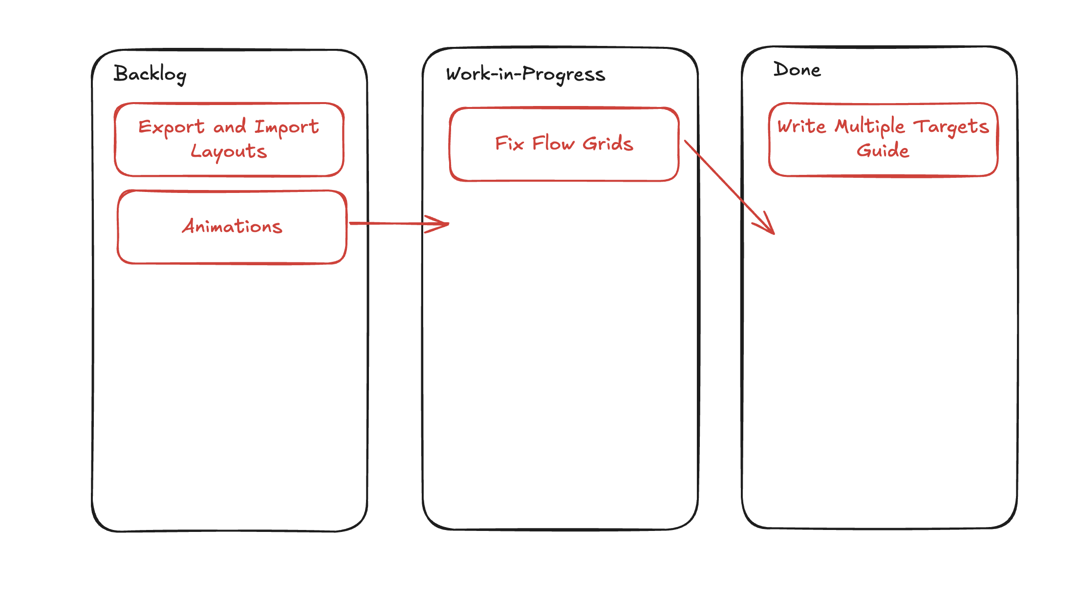
Here, one FlexiTarget for our Kanban board wouldn't be enough, as we have three different [Flow layouts](https://www.flexiboards.dev/docs/flow-grids) to maintain. The board structure that Flexiboards supports (see [Overview](https://www.flexiboards.dev/docs/overview)) lets us put multiple FlexiTargets within the same FlexiBoard.
## Using multiple targets
To add a second target, create another `FlexiTarget` component inside of your `FlexiBoard`. Each `FlexiTarget` has its own configuration, so each target's layout can behave differently from the others.
You can also use the `targetDefaults` property on the `FlexiBoard` configuration object if you want all targets to have consistent behaviour.
The example below builds the Kanban board we described earlier.
**Svelte**
```svelte
[
'bg-muted px-4 py-2 rounded-lg w-full text-base',
widget.isShadow && 'opacity-50',
widget.isGrabbed && 'animate-pulse opacity-50'
]
}
}}
class={'flex flex-col items-center gap-8 lg:flex-row lg:items-stretch lg:justify-center'}
>
);
}
```
Set the target identifier with `keyName` and style the grid with `className`. `FlexiTarget` also accepts `containerClassName`, which styles the element wrapping the grid, so the outer `div`s above could be folded into the targets themselves if you prefer.
With the extra `FlexiTarget` components in place, we can drag and drop widgets within their current target, as well as drop them into the other two.
## Advanced: mixing grids
So far, every target we've dragged between has been a [Flow Grid](https://www.flexiboards.dev/docs/flow-grids). Dragging between a Flow Grid and a [Free-Form Grid](https://www.flexiboards.dev/docs/free-form-grids) works the same way: Flexiboards applies the same drag-and-drop logic whatever grid type the target dropzone uses.
**Svelte**
```svelte
);
}
```
Notice that when the widget switches between the two grids, its background colour changes to reflect the `widgetDefaults` of the grid it is in. That's [Cascading Configuration](https://www.flexiboards.dev/docs/configuration#cascading-configuration): the widget resolves each unspecified property from its nearest ancestor, and its nearest ancestor has changed.
## Examples
The [Notes](https://www.flexiboards.dev/examples/notes) example nests a Kanban board inside another board. Boards nest independently: a widget inside the inner board cannot be moved into the outer one.
## Gotchas
- **Flow grids reset the flow-axis size.** A widget dragged from a free-form grid into a flow grid has its flow-axis dimension (height, for row flow) set to 1, and keeps that size if dragged back out. Store the original size in `metadata` if you need to restore it.
- **Widgets cannot cross boards.** Two `FlexiBoard`s on one page are separate drag-and-drop environments.
---
# Widget rendering
> Learn about approaches to rendering widgets in Flexiboards.
Source: https://www.flexiboards.dev/docs/widget-rendering
`FlexiWidget` registers content in a target. Flexiboards handles placement and interaction; your content defines what the widget displays. This demo uses the [docs example styling](https://www.flexiboards.dev/docs/overview#example-styling):
**Svelte**
Example: Styling by state
```svelte
[
'flex items-center justify-center rounded-lg bg-primary text-primary-foreground',
widget.isShadow && 'opacity-50',
widget.isGrabbed && 'animate-pulse',
widget.dropRejected && 'bg-destructive'
]
}
}}
>
{#snippet children({ widget })}
{widget.isGrabbed ? 'Grabbed' : 'Drag me'}
{/snippet}
Fixed
```
**React**
Example: Styling by state
```tsx
import { FlexiBoard, FlexiTarget, FlexiWidget } from '@flexiboards/react';
import type { FlexiWidgetController } from '@flexiboards/react';
import { clsx } from 'clsx';
export function StylingByState() {
return (
clsx(
'flex items-center justify-center rounded-lg bg-primary text-primary-foreground',
widget.isShadow && 'opacity-50',
widget.isGrabbed && 'animate-pulse',
widget.dropRejected && 'bg-destructive'
)
}
}}
>
{({ widget }) => (widget.isGrabbed ? 'Grabbed' : 'Drag me')}
Fixed
);
}
```
Drag the first widget: its label changes while grabbed, its shadow in the grid is translucent, and it turns red over the fixed widget because that drop would be rejected.
## Children-based
These declaration excerpts belong inside an existing target. Keep the imports and board setup from the opening example.
**Svelte**
Pass a `children` [snippet](https://svelte.dev/docs/svelte/snippet) to render content inline. Any elements or components you write become the content markup of your widget, like any other container component.
Flexiboards passes parameters into the `children` snippet, which you can read or ignore:
```svelte
I'm a FlexiWidget!
{#snippet children({ widget })}
I'm a FlexiWidget at ({widget.x}, {widget.y})!
{/snippet}
```
**React**
Pass `children` to render content inline. Any elements or components you write become the content of your widget, like any other container component.
`children` may also be a _render function_, which Flexiboards calls with the widget's controller. Use the render function to read the widget's reactive state without a separate component:
```tsx
{
/* Without the parameters: plain JSX children */
}
I'm a FlexiWidget!;
{
/* With the parameters, e.g. the widget's reactive state */
}
{({ widget }) => (
<>
I'm a FlexiWidget at ({widget.x}, {widget.y})!
)}
;
```
The first example needs no data from the `widget` controller, so it takes no parameters. The second reads the reactive `x` and `y` properties on the controller and shows them; the [FlexiWidget](https://www.flexiboards.dev/docs/components/widget) API lists the other properties you can read this way.
Use a component when several widgets share a renderer, or when a registry selects content for imported widgets.
## Component-based
**Svelte**
Set `component` to an imported Svelte component. This declaration excerpt assumes `my-component.svelte` exists and belongs inside your existing target:
```svelte
```
Pass props to the component with `componentProps`. A `children` snippet takes precedence over `component`. To wrap the configured component, render `widget.component` with `widget.componentProps` inside that snippet; Flexiboards does not render both automatically.
In this scenario the `widget` controller is not passed as a prop on the component. Instead, use the `getFlexiwidgetCtx` helper function to get the context of the widget:
```svelte
Column {widget.x}, row {widget.y}
```
This uses the [Svelte Context API](https://svelte.dev/docs/svelte/context) under the hood, so call it from the top level of the component, or from a function that the top level calls.
Any Svelte component rendered inside of the FlexiWidget, whether via a snippet or a descendant component, has access to the `widget` controller through the same mechanism.
**React**
Set `component` to an imported React component. This declaration excerpt assumes `my-component.tsx` exists and belongs inside your existing target:
```tsx
import { FlexiWidget } from '@flexiboards/react';
import MyComponent from './my-component';
;
```
Pass props to the component with `componentProps`. The following declaration excerpt assumes `NumberTile` is your imported component with a `number` prop:
```tsx
```
`children` takes precedence over `component`. To wrap the configured component, use a children render function, assign `widget.component` to a capitalized local variable, and render it with `widget.componentProps`. Flexiboards does not render both automatically.
Storing `component` and `componentProps` in a registry entry also supplies content for widgets created from an imported layout or by a `FlexiAdd` using that type.
In this scenario the widget controller is not passed as a prop on the component. Instead, use the `useFlexiWidget()` hook:
```tsx
// my-component.tsx
import { useFlexiWidget } from '@flexiboards/react';
export default function MyComponent() {
const widget = useFlexiWidget();
return
...
;
}
```
The controller returned is a reactive proxy. Read any of its signal-backed getters during render, such as `isGrabbed`, `isShadow`, `dropRejected`, `draggability`, `x` or `y`, and your component re-renders when they change. You need no subscription or extra hook.
Any React component rendered inside of the FlexiWidget, whether via `children` or as a descendant of the widget's component, has access to the `widget` controller through the same hook.
## Styling by state
The class-prop excerpts below extend the opening example. Keep its imports and enclosing board and target.
Whichever approach you use, the widget's own element is styled with its class prop (`class` (Svelte) / `className` (React)), or with `widgetDefaults.className` further up the cascade. It accepts either a class value or a function that receives the widget's controller. Use a class function to style a widget while it is grabbed, previewed, or rejected:
- `isGrabbed` while the widget is being dragged, and `isResizing` while it is being resized.
- `isShadow` on the preview left in the grid while the widget is held.
- `dropRejected` while the widget is over a target that cannot place it. The shadow is withdrawn, the cursor becomes `not-allowed`, and releasing sends the widget back. The same flag is available on the target as `target.dropRejected`.
**Svelte**
```svelte
[
'bg-muted rounded-lg px-4 py-2',
widget.isShadow && 'opacity-50',
widget.isGrabbed && 'animate-pulse opacity-50',
widget.dropRejected && 'opacity-30'
]}
>
I'm a FlexiWidget!
```
**React**
In React, the class function must return a **string**, so compose conditional classes with a helper such as `clsx`:
```tsx
import { FlexiWidget } from '@flexiboards/react';
import type { FlexiWidgetController } from '@flexiboards/react';
import { clsx } from 'clsx';
clsx(
'bg-muted rounded-lg px-4 py-2',
widget.isShadow && 'opacity-50',
widget.isGrabbed && 'animate-pulse opacity-50',
widget.dropRejected && 'opacity-30'
)
}
>
I'm a FlexiWidget!
;
```
---
# Transitions
> Animate widget movement with CSS transitions or springs.
Source: https://www.flexiboards.dev/docs/transitions
Flexiboards is headless, so widgets jump between cells by default. Set `transition` on a widget, or on `widgetDefaults`, to animate the movement instead. `cssTransitionConfig()` supplies the default durations and easing. These demos use native controls and the [example styling](https://www.flexiboards.dev/docs/overview#example-styling). They disable movement when the system requests reduced motion:
**Svelte**
```svelte
{reducedMotion
? 'Reduced motion is on; widgets move without animation.'
: 'Drag A or B to another cell.'}
{reducedMotion
? 'Reduced motion is on; widgets move without animation.'
: 'Drag A or B to another cell.'}
A
B
);
}
```
Enable transitions and drag a widget to an empty cell. The dropped widget animates into place unless reduced motion is enabled. Toggle the system preference while the demo is open to check that it updates.
## Choosing a preset
Two presets ship with the library. Each returns a complete `transition` configuration:
- `cssTransitionConfig()` uses sine in-out for 150ms moves, circ-out for 200ms drops, and ease-out for 150ms resizing.
- `springTransitionConfig()` uses response times of 0.20s for moves, 0.24s for drops, and 0.18s for resizing, with a small bounce on drop. These control the spring's response, rather than a fixed end time.
`simpleTransitionConfig()` is deprecated. It retains the original 150ms preset, with `ease-in-out` for moves and `ease-out` for drops and resizing.
The CSS preset accepts global easing overrides through `--ease-flexi-move`, `--ease-flexi-drop`, and `--ease-flexi-resize`. [Compare CSS and spring motion in the registry demo](https://www.flexiboards.dev/docs/registry/motion).
## Customising transitions
A `transition` configuration has three optional entries, `move`, `drop`, and `resize`, one per kind of widget movement. Each is either a plain `{ duration, easing }` object (a CSS transition, with `duration` in milliseconds and any CSS easing function including `cubic-bezier()`), or an animation adapter:
- `cssTransition({ duration, easing })` is what the plain object resolves to.
- `spring({ duration, bounce })` is a dependency-free spring using SwiftUI's parameterisation: `duration` in seconds is the response time, and `bounce` runs from `0` (critically damped) to `1`.
Mix them per entry, for example a spring for `drop` and a CSS transition for `resize`. Any entry you omit plays no animation. The exact shape is in the [FlexiWidgetTransitionConfiguration reference](https://www.flexiboards.dev/docs/components/widget#flexiwidgettransitionconfiguration).
The example below drives the `move` and `drop` durations from a slider:
**Svelte**
```svelte
{reducedMotion
? 'Reduced motion is on; widgets move without animation.'
: 'Drag A or B to another cell.'}
{reducedMotion
? 'Reduced motion is on; widgets move without animation.'
: 'Drag A or B to another cell.'}
A
B
);
}
```
## Gotchas
- **Why plain CSS transitions don't work.** Widgets are placed with `grid-row` and `grid-column`, which CSS cannot transition. The library measures the before and after boxes and animates a transform between them, so add your transitions through this configuration rather than a stylesheet.
- **Reduced motion.** Transitions are opt-in, so honour `prefers-reduced-motion` by leaving `transition` unset when it matches. See [Accessibility](https://www.flexiboards.dev/docs/accessibility).
- **Configuration lives in core.** The presets, adapters, and types come from `@flexiboards/core` and are re-exported by each adapter package, so the configuration is identical across frameworks.
---
# Exporting and importing layouts
> Save a board's widget layout as JSON and restore it later.
Source: https://www.flexiboards.dev/docs/guides/exporting-importing-boards
Save a board's widget IDs, positions, sizes, types, and metadata as JSON. To restore rendered widgets, give each one a `type` and register its renderer on the board. The example saves a versioned layout in memory. Drag a widget after saving, then select Restore to return to the saved positions.
The preview uses utility classes from the [docs example styling](https://www.flexiboards.dev/docs/overview#example-styling). Layout persistence itself needs no styling dependency.
**Svelte**
Example: Save and restore
```svelte
{#snippet label({ widget }: { widget: FlexiWidgetController })}
{widget.metadata?.label}
{/snippet}
```
**React**
Example: Save and restore
```tsx
import { FlexiBoard, FlexiTarget, FlexiWidget, useFlexiWidget } from '@flexiboards/react';
import type { FlexiBoardController, FlexiLayoutEnvelope } from '@flexiboards/react';
import { useRef, useState } from 'react';
function Label() {
const widget = useFlexiWidget();
return <>{String(widget.metadata?.label ?? '')};
}
const boardConfig = {
registry: {
tile: {
component: Label,
className: 'flex items-center justify-center rounded-lg bg-primary text-primary-foreground',
draggability: 'full'
}
}
} as const;
export function SaveAndRestore() {
const board = useRef(null);
const [saved, setSaved] = useState();
return (
<>
(board.current = controller)}
className="size-72 rounded-b-xl border p-8 lg:size-96"
config={boardConfig}
>
);
}
```
Save and Restore preserve each widget's ID and metadata. The renderer stays in your application; the saved `type` selects it from the registry when loading.
## The registry
A registry maps widget types to rendering configuration. It is required to reconstruct imported widgets. Exporting layout data does not require a registry.
A widget without a `type` is included in exports but skipped during import, with a warning. A typed widget needs a matching registry entry to recover its content. Register every type you intend to restore, and keep target identifiers stable.
The opening example registers `tile`. Registry entries can also define `component`, `componentProps`, `className`, interaction settings, and size limits. These options become defaults when creating a widget of that type. See [FlexiRegistryEntry](https://www.flexiboards.dev/docs/components/board#flexiregistryentry).
**Svelte**
Use a Svelte component or a `snippet` to render a registry entry. The opening example's `label` snippet receives the widget controller.
**React**
Use a React component or the registry entry's `snippet` render function. The `snippet` field receives the widget controller in its argument; it returns React content. The opening example uses the `Label` component and `useFlexiWidget()`.
## Versioning what you store
`exportLayout()` returns a bare `FlexiLayout`. For storage, call `exportLayoutEnvelope()` to get `{ version, layout }`. `importLayout()` and `loadLayout` accept either form. The version identifies the stored format. The current importer unwraps the envelope without migrating it or rejecting unknown versions. Check the version in your storage code before importing data from a different format.
These helpers accept the controller from an existing board. Call `saveLayout` and `restoreLayout` from your application's buttons. They extend the registry and target setup in the opening example.
**Svelte**
```ts
import type { FlexiBoardController } from '@flexiboards/svelte';
const storageKey = 'dashboard-layout';
export function saveLayout(board: FlexiBoardController) {
localStorage.setItem(storageKey, JSON.stringify(board.exportLayoutEnvelope()));
}
export function restoreLayout(board: FlexiBoardController) {
const saved = localStorage.getItem(storageKey);
if (saved !== null) board.importLayout(JSON.parse(saved));
}
```
**React**
```ts
import type { FlexiBoardController } from '@flexiboards/react';
const storageKey = 'dashboard-layout';
export function saveLayout(board: FlexiBoardController) {
localStorage.setItem(storageKey, JSON.stringify(board.exportLayoutEnvelope()));
}
export function restoreLayout(board: FlexiBoardController) {
const saved = localStorage.getItem(storageKey);
if (saved !== null) board.importLayout(JSON.parse(saved));
}
```
Malformed JSON throws during parsing. Decide whether your application should offer a reset or show an error. A TypeScript annotation does not validate stored data; validate data from untrusted sources before using its metadata in application actions.
## Creating widgets with types
Inside an existing target, declare a widget with `type="tile"` to select the `tile` registry entry. Add metadata such as `metadata={{ label: 'A' }}` to supply instance-specific content, as in the opening example.
`type` enables the registry lookup during import. It is not required to read a widget's position through export.
## Exporting layouts
Call `board.exportLayout()` when you need the bare layout for application logic. It maps target identifiers to arrays of widget entries. This illustrative JSON is a bare layout from a target named `main`:
```json
{
"main": [
{
"id": "sales-chart",
"type": "tile",
"x": 0,
"y": 0,
"width": 1,
"height": 1,
"metadata": { "label": "Sales" }
}
]
}
```
Every exported entry has an `id`, supplied by you or generated by Flexiboards. Exporting only reads the layout and does not fire `onLayoutChange`.
For storage, use the [versioned helpers above](https://www.flexiboards.dev/docs/guides/exporting-importing-boards#versioning-what-you-store). For a responsive board, use the [responsive controller](https://www.flexiboards.dev/docs/guides/responsive-layouts#import-and-export), which stores the collection of breakpoint layouts.
## Importing layouts
Call `board.importLayout(saved)` with a bare layout or an envelope. Existing widgets in each target represented by the imported layout are cleared and replaced. The imported target identifiers must match your mounted targets. Entries without a type are skipped.
Import does not fire `onLayoutChange`. Loading a saved state therefore does not automatically save it again. Use the Restore button in the opening example to exercise this behavior.
## Loading on mount
Add `loadLayout` to the board configuration to restore client storage during initialization. It runs once when the board is ready on the client. It can return a bare layout, a versioned envelope, an array of widget entries for a single-target board, or `undefined` to keep the initial layout.
The following excerpt extends the opening example. Keep its registry and targets; add this property to the board's `config` object:
```ts
const persistenceOptions = {
loadLayout: () => {
const saved = localStorage.getItem('dashboard-layout');
return saved === null ? undefined : JSON.parse(saved);
}
};
```
Spread `persistenceOptions` into that configuration. `loadLayout` is skipped during SSR, so it can read browser storage. Changing the callback after initialization does not trigger another load; call `importLayout()` for an explicit reload.
## Initial layouts for server-rendered pages
Pass server-provided layout data as `initialLayout` on the board configuration. It seeds the first render in both frameworks. Keep the registry and target setup from the opening example and add `initialLayout: layout`, where `layout` is the `FlexiLayout` returned by your application.
Send the same initial layout to the server render and client hydration. The widget types resolve through the registry in both environments. See [Server-stored layouts](https://www.flexiboards.dev/docs/guides/server-side-rendering#server-stored-layouts) for framework-specific examples.
On a responsive board, use `initialLayouts`, keyed by breakpoint. If a client loader is also configured, the initial layout renders first and the loader can replace it on the client. See [Responsive layouts](https://www.flexiboards.dev/docs/guides/responsive-layouts).
## Auto-saving with onLayoutChange
Add both callbacks below to the existing board configuration, alongside its registry. `onLayoutChange` receives a bare layout. Wrap it with `LAYOUT_FORMAT_VERSION` when storing it so the saved value has the same envelope shape as `exportLayoutEnvelope()`.
**Svelte**
```ts
import { LAYOUT_FORMAT_VERSION } from '@flexiboards/svelte';
import type { FlexiBoardConfiguration } from '@flexiboards/svelte';
const storageKey = 'dashboard-layout';
const persistenceOptions: Pick = {
loadLayout: () => {
const saved = localStorage.getItem(storageKey);
return saved === null ? undefined : JSON.parse(saved);
},
onLayoutChange: (layout) => {
localStorage.setItem(storageKey, JSON.stringify({ version: LAYOUT_FORMAT_VERSION, layout }));
}
};
```
**React**
```ts
import { LAYOUT_FORMAT_VERSION } from '@flexiboards/react';
import type { FlexiBoardConfiguration } from '@flexiboards/react';
const storageKey = 'dashboard-layout';
const persistenceOptions: Pick = {
loadLayout: () => {
const saved = localStorage.getItem(storageKey);
return saved === null ? undefined : JSON.parse(saved);
},
onLayoutChange: (layout) => {
localStorage.setItem(storageKey, JSON.stringify({ version: LAYOUT_FORMAT_VERSION, layout }));
}
};
```
Spread `persistenceOptions` into the board configuration in the opening example. The loader runs on the client. Layout notifications follow committed interactions and controller actions; synchronous changes are batched into one microtask, before animations settle.
Notifications include accepted drops and resizes, widget creation after initial loading, deletion, and programmatic moves or clears. Hover and validation callbacks are separate. Importing and exporting do not notify. See [Controller actions and callbacks](https://www.flexiboards.dev/docs/controllers#changing-the-board-from-code).
For remote storage, debounce writes if your application needs to limit requests. Keep the most recent layout while a save is pending and surface failed saves to the user.
## Widget IDs
Supply an `id` when a widget corresponds to a record in your application, for example `id="sales-chart"`. Flexiboards generates an ID when you omit it. Both supplied and generated IDs appear in exports and survive import.
Use unique, stable IDs to reconcile saved widgets with application records. The `id` and `type` props identify a widget when it is created; changing them later does not recreate it.
## Working with metadata
Metadata is per-widget JSON data carried through export and import. Use it for values such as a label, data-source key, or chart settings. Keep functions and component references in the registry.
The opening example writes `metadata={{ label: 'A' }}`. These widget-content examples read that label:
**Svelte**
```svelte
{String(widget.metadata?.label ?? '')}
```
**React**
```tsx
// label.tsx, rendered through a registry component entry
import { useFlexiWidget } from '@flexiboards/react';
export function Label() {
const widget = useFlexiWidget();
return {String(widget.metadata?.label ?? '')};
}
```
## Reference
The layout, entry, and registry types are listed on the [FlexiBoard page](https://www.flexiboards.dev/docs/components/board#flexilayout).
---
# Responsive layouts
> Create responsive dashboards that adapt to different screen sizes.
Source: https://www.flexiboards.dev/docs/guides/responsive-layouts
`ResponsiveFlexiBoard` wraps a board and picks a layout for the current viewport width. Each breakpoint keeps its own widget arrangement. The example uses one board whose configuration reads the current breakpoint. Its utility classes use the [docs example styling](https://www.flexiboards.dev/docs/overview#example-styling):
**Svelte**
Example: Responsive columns
```svelte
{#snippet children({ currentBreakpoint })}
{@const columns = currentBreakpoint === 'lg' ? 3 : 2}
A
B
);
}}
);
}
```
Resize the browser across 1024px: the grid switches between three and two columns. Move a widget at one width, resize, and move it at the other, and each arrangement is remembered separately.
> **Breakpoints are independent**
>
> Each breakpoint renders its own separate Flexiboard. Moving, resizing, adding, or removing widgets only affects the currently active breakpoint; changes don't sync across breakpoints.
## Shared board, breakpoint parameter
The example above uses a `children` fallback that receives the current breakpoint. This works well when you want the same board structure with different column counts or sizing:
**Svelte**
```svelte
{#snippet children({ currentBreakpoint })}
{/snippet}
```
**React**
In React, the fallback is `children`. Pass a function to receive the current breakpoint:
```tsx
import { ResponsiveFlexiBoard, FlexiBoard, FlexiTarget } from '@flexiboards/react';
export function Dashboard() {
return (
{({ currentBreakpoint }) => (
)}
);
}
```
## Independent boards per breakpoint
For more control, give each breakpoint its own board content, so each one can use a different board structure. `boardConfig` below is a board configuration with a [registry](https://www.flexiboards.dev/docs/guides/exporting-importing-boards#the-registry) for the `chart` and `stats` types:
**Svelte**
```svelte
({
lg: {
main: [
{ type: 'chart', x: 0, y: 0, width: 2, height: 2 },
{ type: 'stats', x: 2, y: 0, width: 1, height: 1 }
]
},
default: {
main: [
{ type: 'chart', x: 0, y: 0, width: 2, height: 2 },
{ type: 'stats', x: 0, y: 2, width: 2, height: 1 }
]
}
})
}}
>
{#snippet lg()}
{/snippet}
{#snippet children({ currentBreakpoint })}
{/snippet}
```
**React**
Each breakpoint is a prop taking the element to render: `lg`, `md`, `sm` and `xs`. `children` is the fallback.
```tsx
import { ResponsiveFlexiBoard, FlexiBoard, FlexiTarget } from '@flexiboards/react';
import { boardConfig } from './board-config';
const responsiveConfig = {
breakpoints: { lg: 1024 },
loadLayouts: () => ({
lg: {
main: [
{ type: 'chart', x: 0, y: 0, width: 2, height: 2 },
{ type: 'stats', x: 2, y: 0, width: 1, height: 1 }
]
},
default: {
main: [
{ type: 'chart', x: 0, y: 0, width: 2, height: 2 },
{ type: 'stats', x: 0, y: 2, width: 2, height: 1 }
]
}
})
};
function board(columns: number) {
return (
);
}
export function Dashboard() {
return (
{board(2)}
);
}
```
## Supported breakpoints
You can define breakpoints for these keys:
| Breakpoint | Description |
| ---------- | ------------------- |
| `lg` | Large screens |
| `md` | Medium screens |
| `sm` | Small screens |
| `xs` | Extra-small screens |
A default breakpoint (which uses `children`) always implicitly exists, and is used if no breakpoint is matched.
Breakpoints are minimum viewport widths, evaluated largest-first. The first match wins. Add the `breakpoints` property below to your responsive configuration:
```typescript
const config = {
breakpoints: {
lg: 1200, // viewport >= 1200px uses lg
md: 900, // viewport >= 900px uses md
sm: 600 // viewport >= 600px uses sm
// Below 600px, render children for the default breakpoint.
}
};
```
You don't need to define all breakpoints. If only `lg` and `children` are defined, `lg` is used for large screens and `children` for everything else.
## Import and export
Use the responsive controller's `importLayout()` and `exportLayout()` to read or replace the collection of breakpoint layouts. These excerpts extend your existing responsive board. Define `responsiveConfig` with its breakpoints and loader, and retain the board content in the marked space. Wire `save` to your application's save button:
**Svelte**
```svelte
```
**React**
```tsx
import { ResponsiveFlexiBoard } from '@flexiboards/react';
import type { ResponsiveFlexiBoardController } from '@flexiboards/react';
import { useRef } from 'react';
export function Dashboard() {
const responsiveBoard = useRef(null);
function save() {
if (!responsiveBoard.current) return;
const layouts = responsiveBoard.current.exportLayout();
localStorage.setItem('layouts', JSON.stringify(layouts));
}
return (
(responsiveBoard.current = controller)}
>
{/* ... */}
);
}
```
Components rendered inside the board can also reach the controller with the `useResponsiveFlexiBoard()` hook, without threading a ref through.
The responsive controller manages layouts for all breakpoints together.
> **When using responsive dashboards, use the responsive methods**
>
> When a board is rendering in a responsive context, calling `importLayout()` or `exportLayout()` on the inner `FlexiBoard` will log a warning. Always use the `ResponsiveFlexiBoard` controller's methods instead.
## Auto-persistence
For automatic saving, use `loadLayouts` and `onLayoutsChange`. These configuration excerpts keep your existing board content and registry. Stored data must contain layouts whose types exist in that registry:
**Svelte**
```svelte
{
const saved = localStorage.getItem('layouts');
return saved ? JSON.parse(saved) : undefined;
},
onLayoutsChange: (layouts) => {
localStorage.setItem('layouts', JSON.stringify(layouts));
}
}}
>
```
**React**
```tsx
import { ResponsiveFlexiBoard } from '@flexiboards/react';
import type { ResponsiveFlexiLayout } from '@flexiboards/react';
// Defined outside the component so the board isn't handed a new config object
// on every render.
const responsiveConfig = {
breakpoints: { lg: 1024 },
loadLayouts: (): ResponsiveFlexiLayout | undefined => {
const saved = localStorage.getItem('layouts');
return saved ? JSON.parse(saved) : undefined;
},
onLayoutsChange: (layouts: ResponsiveFlexiLayout) => {
localStorage.setItem('layouts', JSON.stringify(layouts));
}
};
export function Dashboard() {
return {/* ... */};
}
```
`loadLayouts` runs only on the client, so the callback can read `localStorage`. The board itself supports server rendering.
As with importing and exporting layouts, prefer these methods over the individual `FlexiBoard`'s methods on a responsive board.
> **Lazy initialisation**
>
> Layouts are created on-demand. If a user never resizes their viewport to trigger a breakpoint, no layout is stored for it. The `onLayoutsChange` callback only includes breakpoints that have been visited.
## Server-side rendering
The server cannot know the viewport, so it guesses a breakpoint. Set `ssrBreakpoint` to the one most visitors land on, and see [Server-Side Rendering](https://www.flexiboards.dev/docs/guides/server-side-rendering#responsive-boards) for handling the mismatch.
---
# Server-side rendering
> How Flexiboards renders boards on the server, and how to handle responsive boards and stored layouts.
Source: https://www.flexiboards.dev/docs/guides/server-side-rendering
**React**
> **Server rendering and hydration**
>
> Declared widgets and `initialLayout` render with `renderToString` and hydrate with `hydrateRoot`. Use these APIs to render the board on the server and attach its interactions during hydration.
## Introduction
Flexiboards supports server-side rendering with SvelteKit (Svelte) / React (React). Declared layouts, or layouts supplied as server data, appear before hydration.
**React**
In React, the first hydration render retains the server's layout and assumed breakpoint. After commit, the adapter reads client storage and the actual viewport, then updates the board. `onfirstcreate` runs on the client, so use `initialLayout` or `initialLayouts` for data that must appear in the server HTML.
In Next.js App Router, compose the board inside a `'use client'` component. Client Components can still be server-rendered; the directive enables the hooks and interaction handlers. Pass serializable layout data from your Server Component and define registry render functions in the client component.
This works because placement is pure logic. Widget positions are computed from your declared configuration, not measured from the DOM, and idle widgets are styled with CSS grid line placement (`grid-column` / `grid-row`) rather than pixel values. The pixel-measuring parts of the library, such as dragging, resizing and pointer tracking, only activate on interaction, which doesn't happen on a server.
Two scenarios need a provisional layout until client initialization:
- **Stored layouts.** A `loadLayout` / `loadLayouts` callback that relies on the client (such as client storage) can't run on the server.
- **Responsive boards.** The server can't know the viewport, so the rendered breakpoint has to be guessed.
The examples below are integration excerpts for an existing board. Keep its target declarations and registry. `boardConfig` refers to that configuration; `DashboardSkeleton` and `BoardSkeleton` are fallback components supplied by your application.
## Server-stored layouts
A layout the _server_ already has, such as a user's saved board fetched from your database, doesn't need any of the suspense machinery below. Pass it as `initialLayout`: a plain layout value (not a callback), applied during the initial render pass on both the server and the client.
**Svelte**
In this SvelteKit excerpt, `getBoardLayout` is your application's database function, exported from `$lib/server/boards`. It returns a `FlexiLayout`. Fetch it in a server `load` function and pass it through page data:
```ts
// +page.server.ts
import type { PageServerLoad } from './$types';
import { getBoardLayout } from '$lib/server/boards';
export const load: PageServerLoad = async ({ locals }) => {
return { layout: await getBoardLayout(locals.user) };
};
```
The page excerpt assumes your application defines `ChartWidget` and `TableWidget` in the files imported below:
```svelte
```
**React**
This excerpt imports your existing `widgetRegistry` from `widget-registry.ts`. Pass the server-fetched layout as a prop and use the same value during hydration:
```tsx
import { FlexiBoard, FlexiTarget, type FlexiLayout } from '@flexiboards/react';
import { widgetRegistry } from './widget-registry';
export function SavedBoard({ layout }: { layout: FlexiLayout }) {
return (
);
}
```
The board server-renders at the layout's final positions with no pending window. Give the client the same data so hydration matches. Like `importLayout`, entries resolve through the [registry](https://www.flexiboards.dev/docs/guides/exporting-importing-boards) via their `type`; targets without an entry in the layout fall back to their declared widgets. On responsive boards the equivalent is `initialLayouts`, keyed by breakpoint.
If a client-side `loadLayout` is also configured (say, local drafts beating the server copy), it still runs at hydration and overrides the initial layout. The board is marked pending until it does, as described next.
## Stored layouts and suspense
A board configured with `loadLayout` (or a responsive board with `loadLayouts`) usually reads from `localStorage` or a per-user store, which does not live on the server. Flexiboards therefore **skips the callback during SSR** and renders the layout declared in your markup as a stand-in (which can be empty). On the client, the callback runs during hydration and the stored layout replaces the stand-in.
> **Your callback never runs on the server**
>
> Flexiboards invokes `loadLayout` only on the client. If your application calls the same function elsewhere, that caller must also run in the browser.
Until that import resolves, the board's rendered layout may be wrong, since a returning user's saved arrangement can differ arbitrarily from the declared one. Give `FlexiBoard` a `suspense` snippet (Svelte) / render function (React) to show a fallback:
**Svelte**
```svelte
{#snippet suspense({ reason })}
{/snippet}
…
```
**React**
```tsx
}>
…
```
The fallback is server-rendered alongside the board and shown in its place from the very first paint, before any JavaScript runs. It unmounts the moment the layout is confirmed on the client. `reason` tells you why it's showing: `'layout'` here, or `'breakpoint'` for the responsive case [below](#responsive-boards). Since it's ordinary markup, style it however you like, including with responsive utility classes.
### Styling it yourself with CSS
If you'd rather keep the real board visible and veil it (skeleton tints over the stand-in's geometry, say), omit the suspense fallback. A pending board always marks its root element, which you can target with plain CSS:
```html
…
```
The attribute is present in the server HTML and during hydration, and is removed the moment the initial load resolves. That happens even when nothing was stored, since at that point the declared layout is confirmed final. Because it's plain markup, you can build a **CSS-only skeleton** that applies from the first paint, with no JavaScript involved:
```css
/* Disable interaction and veil widget contents behind skeleton tints. */
[data-flexi-pending] {
pointer-events: none;
}
[data-flexi-pending] [role='gridcell'] {
position: relative;
}
[data-flexi-pending] [role='gridcell'] > * {
visibility: hidden;
}
[data-flexi-pending] [role='gridcell']::after {
content: '';
position: absolute;
inset: 0;
border-radius: 10px;
background: color-mix(in oklab, currentColor 7%, transparent);
}
```
The veil keeps the stand-in's geometry as gray blocks, a real skeleton, and the swap to the stored layout happens underneath it.
### Boards that declare no widgets
If everything on a board arrives through `loadLayout` (no `FlexiWidget` declarations at all), the server renders empty grids and the cell veil has nothing to cover. Pseudo-elements participate in grid layout as items, so you can paint ghost placeholder rows into empty pending grids:
```css
[data-flexi-pending] [role='grid']:not(:has([role='gridcell']))::before,
[data-flexi-pending] [role='grid']:not(:has([role='gridcell']))::after {
content: '';
grid-column: 1 / -1;
min-height: 2.75rem;
border-radius: 10px;
background: color-mix(in oklab, currentColor 7%, transparent);
}
```
### Reading pending state from code
The flag is also exposed on the controller as `board.layoutPending` if you'd rather drive a custom loading treatment from your own markup.
## Responsive boards
A `ResponsiveFlexiBoard` picks its breakpoint with `matchMedia`, which we can't know ahead of time on the server. Flexiboards therefore chooses one breakpoint to render as a best guess. By default, this is the `default` breakpoint, which is usually your smallest layout, and desktop visitors, for example, would see a narrow board flash before hydration corrects it.
### Declaring an SSR breakpoint
The first strategy for this is to tell the server which breakpoint to assume, with `ssrBreakpoint`:
**Svelte**
```svelte
```
**React**
```tsx
{/* boards */}
```
Set this to the breakpoint most of your visitors land on. That reduces how often the rendered breakpoint mismatches theirs.
### Handling mismatches
The second strategy decides what a visitor sees when the breakpoint mismatches, before hydration has a chance to apply. The same `suspense` snippet (Svelte) / render function (React) covers this. Pass it to the `FlexiBoard` inside your responsive board:
**Svelte**
```svelte
{#snippet children({ currentBreakpoint })}
{#snippet suspense({ reason })}
{/snippet}
{/snippet}
```
**React**
```tsx
{({ currentBreakpoint }) => (
}>
{/* targets */}
)}
```
Flexiboards derives the assumed breakpoint's viewport range from your `breakpoints` config and generates the media query itself, so all three outcomes are handled with nothing hardcoded:
- **The guess matches the viewport.** The server board is correct: it shows untouched from first paint, fallback hidden.
- **The guess doesn't match.** The fallback shows instead of the wrong-shaped board until hydration swaps in the right one. Since the fallback is your markup, responsive utility classes inside it shape it for the actual viewport.
- **After hydration.** The fallback unmounts and the real board is confirmed.
`reason` is `'breakpoint'` here, with `assumed` carrying the guessed key. It is `'layout'` when an unresolved `loadLayouts` means the content itself is unknown, in which case the fallback shows at every viewport.
### Styling mismatches yourself with CSS
The pending attribute carries the guess too: `data-flexi-pending="lg"` until the client confirms, with `"layout"` winning when both apply. Your breakpoint thresholds are known constants, so CSS can handle the same three outcomes by hand. With `ssrBreakpoint: 'lg'` at a 1024px threshold, that's:
```css
/* Viewport matches the guess: lift the veil entirely. */
@media (width >= 1024px) {
[data-flexi-pending='lg'] {
pointer-events: auto;
}
[data-flexi-pending='lg'] [role='gridcell'] > * {
visibility: visible;
}
[data-flexi-pending='lg'] [role='gridcell']::after,
[data-flexi-pending='lg'] [role='grid']::before,
[data-flexi-pending='lg'] [role='grid']::after {
content: none;
}
}
/* Viewport doesn't match: hide the wrong-shaped cells, show stacked bars. */
@media (width < 1024px) {
[data-flexi-pending='lg'] [role='gridcell'] {
display: none;
}
[data-flexi-pending='lg'] [role='grid']::before,
[data-flexi-pending='lg'] [role='grid']::after {
content: '';
grid-column: 1 / -1;
min-height: 2.75rem;
border-radius: 10px;
background: color-mix(in oklab, currentColor 7%, transparent);
}
}
```
The media query ranges are hardcoded to your own breakpoint thresholds. That is a small duplication, but it keeps the whole treatment in CSS, with zero layout shift for correctly-guessed visitors.
> **Guessing per request**
>
> Choose `ssrBreakpoint` from request information if your application has it. A mobile-device hint cannot tell you the viewport width, and headers may be absent. Keep a default guess and the mismatch treatment above. Measure your own traffic before relying on request hints to improve the initial layout.
The guess is also exposed on the controller as `board.breakpointPending` (`string | null`).
> **Client-side rendering**
>
> A client-only route has no server HTML to hydrate. Both adapters support this mode too. Client storage and responsive breakpoints resolve when the board mounts; use the same suspense fallback if you want to hide its provisional content.
## Summary
| Situation | Server renders | Marked with | Resolves |
| ------------------------------------------------ | ------------------------------------------- | ----------------------------------- | ------------------------------ |
| Declared layout, no stored state | The final board | Nothing | Already final |
| `initialLayout` / `initialLayouts` (server data) | The final board | Nothing | Already final |
| `loadLayout` / `loadLayouts` configured | Declared or initial stand-in | `data-flexi-pending="layout"` | Client import at hydration |
| Responsive board | The `ssrBreakpoint` (else `default`) layout | `data-flexi-pending=""` | Real `matchMedia` at hydration |
---
# Testing
> Drive a board in a unit test with @flexiboards/testing, in a DOM that has no layout.
Source: https://www.flexiboards.dev/docs/guides/testing
happy-dom and jsdom report every element as zero-sized and never fire `ResizeObserver`. A board mounted there renders fine, but a pointer position resolves to no cell and a drop goes nowhere. `@flexiboards/testing` stubs exactly what core reads and dispatches the events a user would, so a component test can grab, move, and drop a widget. The adapters' own suites run on it.
```shell
npm install -D @flexiboards/testing vitest happy-dom
```
## Set up once
The examples use Vitest with happy-dom and explicit test imports. Add the following to a dedicated `vitest.config.ts`, or merge the `test` settings into your existing configuration. Keep any plugins and aliases your application already needs.
**Svelte**
The Svelte fixture needs the Svelte Vite plugin. Existing Svelte Vite projects already have it; otherwise install it:
```shell
npm install -D @sveltejs/vite-plugin-svelte
```
```ts
// vitest.config.ts
import { defineConfig } from 'vitest/config';
import { svelte } from '@sveltejs/vite-plugin-svelte';
export default defineConfig({
plugins: [svelte()],
resolve: { conditions: ['browser'] },
test: { environment: 'happy-dom', setupFiles: ['tests/setup.ts'] }
});
```
**React**
```ts
// vitest.config.ts
import { defineConfig } from 'vitest/config';
export default defineConfig({
esbuild: { jsx: 'automatic' },
test: { environment: 'happy-dom', setupFiles: ['tests/setup.ts'] }
});
```
These examples import `act` from `react` for React 18.3 and 19. With React 18.0–18.2, import `act` from `react-dom/test-utils` in both `tests/setup.ts` and the test file instead.
Install the `ResizeObserver` stand-in and tell the helpers how to settle the DOM after each dispatch in `tests/setup.ts`:
**Svelte**
```ts
// tests/setup.ts
import { flushSync } from 'svelte';
import { configure, installResizeObserver } from '@flexiboards/testing';
installResizeObserver();
configure({
flush: (work) => {
const result = work();
flushSync();
return result;
}
});
```
**React**
```ts
// tests/setup.ts
import { act } from 'react';
import { configure, installResizeObserver } from '@flexiboards/testing';
(globalThis as Record).IS_REACT_ACT_ENVIRONMENT = true;
installResizeObserver();
configure({ flush: act });
```
## Create a test fixture
Save this fixture beside the test as `tests/board.svelte` (Svelte) / `tests/board.tsx` (React). It has one widget at column 0, row 0 and an empty cell to its right.
**Svelte**
```svelte
A
```
**React**
```tsx
// tests/board.tsx
import { FlexiBoard, FlexiTarget, FlexiWidget } from '@flexiboards/react';
export function Board() {
return (
A
);
}
```
## Give the board geometry
After mounting, call `layoutGrid`. It reads the grid's `aria-colcount` and `aria-rowcount`, sizes the board and grid as a square grid of `cellPx` tracks, gives every cell a box from its aria position, and fires the resize observers so core picks the sizes up. Call it again after the widget set changes. It returns a function that restores `getComputedStyle`.
**Svelte**
```ts
// tests/board.test.ts
import { it, expect } from 'vitest';
import { mount, unmount, flushSync } from 'svelte';
import {
layoutGrid,
cells,
grabByKeyboard,
pointerMove,
dropByKeyboard
} from '@flexiboards/testing';
import Board from './board.svelte';
it('moves a widget to the cell under the pointer', async () => {
const component = mount(Board, { target: document.body });
flushSync();
const restore = layoutGrid(100);
grabByKeyboard(cells()[0]);
pointerMove(150, 50); // column 1, row 0 of a grid with 100px cells
dropByKeyboard();
expect(cells()[0].getAttribute('aria-colindex')).toBe('2');
restore();
await unmount(component);
});
```
**React**
```tsx
// tests/board.test.tsx
import { it, expect } from 'vitest';
import { act } from 'react';
import { createRoot } from 'react-dom/client';
import {
flushTimers,
layoutGrid,
cells,
grabByKeyboard,
pointerMove,
dropByKeyboard
} from '@flexiboards/testing';
import { Board } from './board';
it('moves a widget to the cell under the pointer', async () => {
const host = document.body.appendChild(document.createElement('div'));
const root = createRoot(host);
act(() => root.render());
const restore = layoutGrid(100);
grabByKeyboard(cells()[0]);
pointerMove(150, 50); // column 1, row 0 of a grid with 100px cells
dropByKeyboard();
expect(cells()[0].getAttribute('aria-colindex')).toBe('2');
restore();
act(() => root.unmount());
await flushTimers();
host.remove();
});
```
Run the test with `npx vitest run tests/board.test`. A successful move changes `aria-colindex` to `2`, which means model column `x: 1`. ARIA row and column indices start at 1; controller coordinates, `cellAt(x, y)`, and stored layouts start at 0. In a larger suite, move cleanup into `afterEach` so it also runs after failed assertions.
## Helpers
| Helper | What it does |
| ------------------------------------------------------------------------------- | --------------------------------------------------------------------------------------------------------------------------------------------------- |
| `configure({ flush })` | Wraps every dispatch. Run dispatch, then flushSync(). (Svelte) / Wrap dispatch in act(). (React) |
| `installResizeObserver()` | Replaces the global with a mock that `layoutGrid` fires. Returns a restore function. |
| `layoutGrid(cellPx?, { grid, left, top })` | Geometry for one grid, from its aria attributes. Returns a restore function. |
| `setRect(el, { left, top, width, height })` | A box for any element, such as the board around a nested grid. |
| `cells()`, `realCells()`, `cellAt(x, y)` | Widget cells in the document. `realCells` drops the drop preview shown mid-grab. |
| `portal()` | The element a grabbed widget moves into for the duration of the grab. |
| `grabByKeyboard(el)`, `arrow(...keys)`, `dropByKeyboard()`, `cancelGrab()` | The keyboard gesture, in pieces. |
| `pointerDown(el, x, y)`, `pointerMove(x, y)`, `pointerUp()`, `dragTo(el, x, y)` | The pointer gesture, in pieces or in one call. |
| `keydown(el, key)` | Any other key. |
| `mockFrames()` | Queues `requestAnimationFrame` so a drop flight can be stepped with `flush()`. |
| `flushTimers()` | Awaits one macrotask for pending timer work. (Svelte) / Awaits one macrotask for deferred controller cleanup after unmount. (React) |
## What to assert
Placed widget cells carry their position as `aria-colindex`, `aria-rowindex`, `aria-colspan` and `aria-rowspan`, so a layout assertion is an attribute read. For the model side, take the controller from `onfirstcreate` and read `board.exportLayout()` or `widget.x`. While a widget is grabbed, its role changes to `group` and its grid indices are omitted. Assert `isGrabbed` during the gesture and coordinates after the drop. `cells()` and `realCells()` use `data-flexi-widget`, so they still find the held widget.
> **Long-press triggers**
>
> `dragTo` assumes the default immediate trigger. For a long-press trigger, call `pointerDown`, advance fake timers past the press duration, then `pointerMove` and `pointerUp`.
---
# Registry introduction
> Composable Flexiboards components, copied into your project and styled by your shadcn theme.
> **Registry preview.** The registry is currently in preview. We'd love your feedback. [Share feedback on GitHub](https://github.com/Blakintosh/svelte-flexiboards/issues).
Source: https://www.flexiboards.dev/docs/guides/registry
The registry provides styled Svelte (Svelte) / React (React) components built on the Flexiboards primitives. The CLI copies them into your app, where you can edit the source. They use your existing shadcn theme.
Start here for installation details, then choose a component below.
## Components
| Component | Use it for |
| --------------------------------------------- | -------------------------------------------------------------- |
| [Dashboard](https://www.flexiboards.dev/docs/registry/dashboard) | Free-form tiles with headers, content, grabbers, and resizers. |
| [Sortable List](https://www.flexiboards.dev/docs/registry/sortable-list) | Reorderable rows with any content you need. |
| [Board](https://www.flexiboards.dev/docs/registry/board) | Custom layouts and multiple targets on one board. |
| [Grabber](https://www.flexiboards.dev/docs/registry/grabber) | A themed drag handle for any widget. |
| [Resizer](https://www.flexiboards.dev/docs/registry/resizer) | A themed resize handle for any resizable widget. |
Each page has a working preview, source example, installation command, and API notes. The docs framework menu selects the API and examples throughout.
## Motion
Boards, dashboards, and sortable lists animate movement by default and respect reduced motion. [Compare CSS and spring presets](https://www.flexiboards.dev/docs/registry/motion), or disable transitions through the existing configuration.
## Composition
Families use namespace imports: `Dashboard.Root`, `Dashboard.Item`, `Dashboard.Header`, and so on. You control the content and decide where handles belong. The wrappers preserve the underlying configuration and controller APIs.
Compose the components around your application's content, navigation, and actions.
## Your theme, your source
**Svelte**
Start with a Tailwind project configured for [shadcn-svelte](https://www.shadcn-svelte.com/docs/installation), including its theme variables and `cn` utility.
**React**
Start with a Tailwind project configured for [shadcn](https://ui.shadcn.com/docs/installation), including its theme variables and `cn` utility.
The CLI copies source and resolves the required framework adapter, icons, and utility.
Surfaces inherit `card`, `card-foreground`, `border`, and `muted`; handles inherit `accent` and `ring`. Your existing light and dark theme applies automatically. No fonts, global CSS, or color variables are overwritten.
Use `class` (Svelte) / `className` (React) to adjust the defaults. Widget class functions can respond to controller state, and consumer classes are merged last. For deeper changes, edit the installed source.
## Registry endpoints
**Svelte**
The [registry index](https://www.flexiboards.dev/r/svelte/registry.json) lists the installable items.
**React**
The [registry index](https://www.flexiboards.dev/r/react/registry.json) lists the installable items.
`flexi-handles` remains available as a combined grabber/resizer install, and the old convenience sortable list API is retained.
The registry is currently unversioned. Review source diffs before asking the CLI to overwrite an existing installation; copied files do not update automatically with npm package upgrades.
## Two meanings of registry
This source registry is separate from `FlexiBoard.config.registry`. The latter maps widget types to renderers when [restoring saved layouts](https://www.flexiboards.dev/docs/guides/exporting-importing-boards). The installed components can be used in those renderers, but installing them does not register persisted widget types for you.
---
# Dashboard
> Composable, draggable and resizable tiles with your shadcn theme.
> **Registry preview.** The registry is currently in preview. We'd love your feedback. [Share feedback on GitHub](https://github.com/Blakintosh/svelte-flexiboards/issues).
Source: https://www.flexiboards.dev/docs/registry/dashboard
Use `Dashboard.Root`, `Item`, `Header`, `Content`, `Grabber`, and `Resizer` to compose a dashboard without adopting a whole application layout. The metrics below are ordinary content, not built-in widget types.
## Preview
**Svelte**
```svelte
Revenue
$24,560
This month
Subscribers
1,284
Active accounts
```
**React**
```tsx
'use client';
import * as Dashboard from '@/components/flexi-dashboard';
export function DashboardDemo() {
return (
Revenue
$24,560
This month
Subscribers
1,284
Active accounts
);
}
```
## Installation
Start with a Tailwind project configured for shadcn and its theme variables. This copies editable source into your components directory; it does not install a second theme.
**Svelte**
```shell
npx shadcn-svelte@latest add https://flexiboards.dev/r/svelte/flexi-dashboard.json
```
**React**
```shell
npx shadcn@latest add https://flexiboards.dev/r/react/flexi-dashboard.json
```
## Anatomy
`Root` owns one free-form target. Declare `Item` components inside it; put headers, content, and handles inside each item. You can omit either presentation wrapper or replace its contents with your own components.
## API
| Part | Props and defaults |
| --------------------- | ------------------------------------------------------------------------------------------------------------------------------------------------ |
| `Root` | All [FlexiDashboard props](https://www.flexiboards.dev/docs/presets#dashboard-grid). Resizing is enabled by default, with 4 columns, 3 rows, 160px row tracks, and `gap-4`. |
| `Item` | All [FlexiWidget props](https://www.flexiboards.dev/docs/components/widget), including coordinates, dimensions, metadata, configuration, and controller access. |
| `Header` | Ordinary div attributes and children. Aligns a title and actions. |
| `Content` | Ordinary div attributes and children. Fills remaining space and scrolls overflow. |
| `Grabber` / `Resizer` | [Grabber](https://www.flexiboards.dev/docs/registry/grabber) and [Resizer](https://www.flexiboards.dev/docs/registry/resizer) props. |
Use `class` (Svelte) / `className` (React) to override styles. Item classes also accept a function of the widget controller. Consumer classes are merged last, including when customizing shadow and grabbed states.
## Sizing and responsiveness
Set `columns`, `rows`, and `maxRows` explicitly for your content. Override row tracks with `targetConfig={{ rowSizing: '200px' }}`. Place a resize handle in each resizable tile; pass `resizable={false}` to disable resizing for the dashboard.
The default grid is fixed-column, not an automatic breakpoint layout. For different saved layouts at different screen sizes, compose the headless [ResponsiveFlexiBoard](https://www.flexiboards.dev/docs/components/responsive-board) with targets and these themed items.
## Saving layouts
Pass `config.onLayoutChange` to receive the exported layout, and use the existing [import/export APIs](https://www.flexiboards.dev/docs/guides/exporting-importing-boards). This installable source registry is separate from `config.registry`, which maps persisted widget types to rendered content.
**React**
In Next.js, compose these components inside a client component.
The underlying [SSR and hydration support](https://www.flexiboards.dev/docs/guides/server-side-rendering) is unchanged.
## Motion
Movement uses short CSS transitions by default and respects reduced motion. [Compare presets or disable transitions](https://www.flexiboards.dev/docs/registry/motion).
---
# Sortable list
> Reorder custom rows with handles, keyboard controls, and order callbacks.
> **Registry preview.** The registry is currently in preview. We'd love your feedback. [Share feedback on GitHub](https://github.com/Blakintosh/svelte-flexiboards/issues).
Source: https://www.flexiboards.dev/docs/registry/sortable-list
Compose `SortableList.Root`, `Item`, and `Grabber`. You own each row's content: labels, badges, checkboxes, and menus can live alongside the handle.
## Preview
**Svelte**
```svelte
);
}
```
## Installation
Start with a Tailwind project configured for shadcn and its theme variables. This copies editable source into your components directory; it does not install a second theme.
**Svelte**
```shell
npx shadcn-svelte@latest add https://flexiboards.dev/r/svelte/flexi-sortable-list.json
```
**React**
```shell
npx shadcn@latest add https://flexiboards.dev/r/react/flexi-sortable-list.json
```
## API
| Part | Props and defaults |
| --------- | ---------------------------------------------------------------------------------------------------------------------------------------------------------------------- |
| `Root` | All [FlexiSortable props](https://www.flexiboards.dev/docs/presets#sortable-list), plus `onreorder(ids)` (Svelte) / `onReorder(ids)` (React). Vertical by default, with `gap-2`. |
| `Item` | All [FlexiWidget props](https://www.flexiboards.dev/docs/components/widget), plus a required, unique string `id`. It is stored in `metadata.id` for order reporting. |
| `Grabber` | [Grabber props](https://www.flexiboards.dev/docs/registry/grabber), including an accessible `label`. |
Use keyed each blocks (Svelte) / React keys (React) alongside the item `id`. The item's `id` wins over a conflicting `metadata.id`.
## Reading the order
The board owns the displayed layout; children declare the items, not a controlled order. The callback reports IDs in layout order after a layout change (including drops, deletion, and programmatic moves), not initial creation or layout import. Store the returned order in your application, or persist the full layout with `config.onLayoutChange`. Both callbacks run when provided.
A custom target key (`key` (Svelte) / `keyName` (React)) is respected by the callback. For multiple lists that exchange items, use [Board](https://www.flexiboards.dev/docs/registry/board) instead of nesting separate roots.
## Customization
Use `class` (Svelte) / `className` (React) on Root for spacing and on Item for the row surface. Set `direction="horizontal"` for a horizontal list. Underlying sizing and behavior options remain available through `config`, `targetConfig`, and individual widget props.
A handle keeps dragging away from the rest of the row. Place interactive controls beside the handle, not inside it. Resizing is off by default, as rows normally size to their content.
## Existing convenience API
**Svelte**
The original default export from `sortable-list.svelte` is retained.
**React**
The original `SortableList` export from `sortable-list.tsx` is retained.
It still accepts `items: { id, label }[]` and the reorder callback; new compositions should use the namespace API above.
## Motion
Movement uses short CSS transitions by default and respects reduced motion. [Compare presets or disable transitions](https://www.flexiboards.dev/docs/registry/motion).
---
# Board
> Themed primitives for custom grids and multiple drop targets.
> **Registry preview.** The registry is currently in preview. We'd love your feedback. [Share feedback on GitHub](https://github.com/Blakintosh/svelte-flexiboards/issues).
Source: https://www.flexiboards.dev/docs/registry/board
Use `Board.Root`, `Target`, and `Item` when a single dashboard or list preset is too restrictive. Targets share one board, so widgets can move between them.
## Preview
**Svelte**
```svelte
{#snippet header()}
Planned
{/snippet}
Write the docs
{#snippet header()}
Ready
{/snippet}
Record the demo
```
**React**
```tsx
'use client';
import * as Board from '@/components/flexi-board';
const targetConfig = {
rowSizing: '96px',
layout: { type: 'flow', flowAxis: 'row', placementStrategy: 'append', columns: 1 }
} as const;
export function BoardDemo() {
return (
Planned}
>
Write the docsReady}
>
Record the demo
);
}
```
## Installation
Start with a Tailwind project configured for shadcn and its theme variables. This copies editable source into your components directory; it does not install a second theme.
**Svelte**
```shell
npx shadcn-svelte@latest add https://flexiboards.dev/r/svelte/flexi-board.json
```
**React**
```shell
npx shadcn@latest add https://flexiboards.dev/r/react/flexi-board.json
```
## API
| Part | Underlying API | Defaults |
| --------------------- | --------------------------------------------------------------------- | ---------------------------------------------------------------------------- |
| `Root` | [FlexiBoard](https://www.flexiboards.dev/docs/components/board) | Theme foreground; widgets fully draggable. |
| `Target` | [FlexiTarget](https://www.flexiboards.dev/docs/components/target) | Muted, bordered container; padded grid with a minimum drop area and `gap-3`. |
| `Item` | [FlexiWidget](https://www.flexiboards.dev/docs/components/widget) | Card surface, border, radius, and grabbed/shadow styles. |
| `Grabber` / `Resizer` | [Grabber](https://www.flexiboards.dev/docs/registry/grabber) / [Resizer](https://www.flexiboards.dev/docs/registry/resizer) | Labeled, focus-visible handle buttons. |
Props pass through to the underlying primitive. Controller bindings and onfirstcreate callbacks remain available. (Svelte) / The onfirstcreate callback remains available for controller access. (React) Item class functions receive the widget controller.
## Choosing a layout
Configure each target with a [flow grid](https://www.flexiboards.dev/docs/flow-grids) or a [free-form grid](https://www.flexiboards.dev/docs/free-form-grids). Use unique, stable target keys for persistence. Set the target identifier with `key` (Svelte) / `keyName` (React).
Style the outer target with `containerClass` (Svelte) / `containerClassName` (React); `class` (Svelte) / `className` (React) styles the grid itself. Put target headings in the `header` snippet (Svelte) / prop (React) so they are rendered outside the widget declarations.
## Behavior
The source wrappers style the underlying Flexiboards components. Use the existing `canDrop`, widget defaults, layout callbacks, and controller APIs for application rules. Explicit configuration overrides the wrappers' defaults.
Resizing is opt-in here: set `resizability="both"` on an item (or through widget defaults) and add a Resizer. Dashboard enables it for you.
## Application layout
Compose targets into your application's board layout. Add your own headings, navigation, and actions around them.
## Motion
Movement uses short CSS transitions by default and respects reduced motion. [Compare presets or disable transitions](https://www.flexiboards.dev/docs/registry/motion).
---
# Grabber
> Move widgets with a small, theme-aware handle.
> **Registry preview.** The registry is currently in preview. We'd love your feedback. [Share feedback on GitHub](https://github.com/Blakintosh/svelte-flexiboards/issues).
Source: https://www.flexiboards.dev/docs/registry/grabber
A styled [FlexiGrab](https://www.flexiboards.dev/docs/components/grab) button for use inside a `FlexiWidget`. Install it from the registry, then import the copied source from your app.
## Preview
**Svelte**
```svelte
Notes
```
**React**
```tsx
'use client';
import { FlexiDashboard, FlexiWidget } from '@flexiboards/react';
import { Grabber } from '@/components/flexi-handles/grabber';
export function GrabberDemo() {
return (
Notes
);
}
```
## Installation
Start with a Tailwind project configured for shadcn and its theme variables. This copies editable source into your components directory; it does not install a second theme.
**Svelte**
```shell
npx shadcn-svelte@latest add https://flexiboards.dev/r/svelte/flexi-grabber.json
```
**React**
```shell
npx shadcn@latest add https://flexiboards.dev/r/react/flexi-grabber.json
```
## Usage
**Svelte**
The default install location is `src/lib/components/flexi-handles/grabber.svelte`. Import it in your app:
```svelte
```
**React**
The CLI copies `grabber.tsx` into `flexi-handles` under your configured components directory. Import it through your app's alias:
```tsx
import { Grabber } from '@/components/flexi-handles/grabber';
```
The handle is also re-exported from the component families.
## API
| Prop | Default | Purpose |
| ------------------------------------------------------- | ------------------ | ---------------------------------------------------------------------------------------------------------------------------------- |
| `label` | `Move widget` | Screen-reader text; use a specific label when several handles are present. |
| `size` | `16` | Icon size in pixels. The button remains 32px. |
| `class` (Svelte) / `className` (React) | None | Override styles; accepts a widget-state function too. |
| `children` | Vertical grip icon | Replace the icon with a snippet (Svelte) / a render function or content (React). The accessible label is retained. |
## Behavior and keyboard access
A grabber must be inside a draggable widget. All three registry roots enable dragging by default. Once a grabber is mounted, the widget body no longer initiates a drag; the handle does.
Focus the handle and press Enter to start, use arrow keys to move the virtual pointer, press Enter to finish, and Escape to cancel. See [Accessibility](https://www.flexiboards.dev/docs/accessibility) for the full keyboard model.
These are real non-submit buttons. Don't nest links, buttons, or inputs inside a handle; put them alongside it. For larger touch targets, override with `size-11`.
## Styling
Colors come from `muted-foreground`, `accent`, `accent-foreground`, and `ring`. No hard-coded palette or dark-mode override is installed. The defaults inherit your existing shadcn theme.
---
# Resizer
> Resize widgets with a small, theme-aware handle.
> **Registry preview.** The registry is currently in preview. We'd love your feedback. [Share feedback on GitHub](https://github.com/Blakintosh/svelte-flexiboards/issues).
Source: https://www.flexiboards.dev/docs/registry/resizer
A styled [FlexiResize](https://www.flexiboards.dev/docs/components/resize) button for use inside a `FlexiWidget`. Install it from the registry, then import the copied source from your app.
## Preview
**Svelte**
```svelte
Notes
```
**React**
```tsx
'use client';
import { FlexiDashboard, FlexiWidget } from '@flexiboards/react';
import { Resizer } from '@/components/flexi-handles/resizer';
export function ResizerDemo() {
return (
Notes
);
}
```
## Installation
Start with a Tailwind project configured for shadcn and its theme variables. This copies editable source into your components directory; it does not install a second theme.
**Svelte**
```shell
npx shadcn-svelte@latest add https://flexiboards.dev/r/svelte/flexi-resizer.json
```
**React**
```shell
npx shadcn@latest add https://flexiboards.dev/r/react/flexi-resizer.json
```
## Usage
**Svelte**
The default install location is `src/lib/components/flexi-handles/resizer.svelte`. Import it in your app:
```svelte
```
**React**
The CLI copies `resizer.tsx` into `flexi-handles` under your configured components directory. Import it through your app's alias:
```tsx
import { Resizer } from '@/components/flexi-handles/resizer';
```
The handle is also re-exported from the component families.
## API
| Prop | Default | Purpose |
| ------------------------------------------------------- | -------------------- | ---------------------------------------------------------------------------------------------------------------------------------- |
| `label` | `Resize widget` | Screen-reader text; use a specific label when several handles are present. |
| `size` | `16` | Icon size in pixels. The button remains 32px. |
| `class` (Svelte) / `className` (React) | None | Override styles; accepts a widget-state function too. |
| `children` | Diagonal resize icon | Replace the icon with a snippet (Svelte) / a render function or content (React). The accessible label is retained. |
## Behavior and keyboard access
Enable widget resizing with `resizability="both"`, `"horizontal"`, or `"vertical"`. The Dashboard registry root enables both axes by default. Merely adding a handle does not enable resizing.
Focus the handle and press Enter to start, use arrow keys to move the virtual pointer, press Enter to finish, and Escape to cancel. See [Accessibility](https://www.flexiboards.dev/docs/accessibility) for the full keyboard model.
These are real non-submit buttons. Don't nest links, buttons, or inputs inside a handle; put them alongside it. For larger touch targets, override with `size-11`.
## Styling
Colors come from `muted-foreground`, `accent`, `accent-foreground`, and `ring`. No hard-coded palette or dark-mode override is installed. The defaults inherit your existing shadcn theme.
---
# Motion
> Compare registry transitions and customise their easing.
> **Registry preview.** The registry is currently in preview. We'd love your feedback. [Share feedback on GitHub](https://github.com/Blakintosh/svelte-flexiboards/issues).
Source: https://www.flexiboards.dev/docs/registry/motion
**Svelte**
```svelte
(order = ids)}>
{#each tasks as task (task)}
{task}
{/each}
{reducedMotion.current ? 'Reduced motion is on.' : 'Drag a handle to compare the presets.'}
{reducedMotion ? 'Reduced motion is on.' : 'Drag a handle to compare the presets.'}
Order: {order.join(', ')}
);
}
```
Registry boards, dashboards, and sortable lists use `cssTransitionConfig()` by default: 150ms for moves and resizing, and 200ms for drops. The headless components still leave transitions unset.
The layout and reorder callback update as soon as a drop is accepted, while the card animates into place.
The CSS preset uses sine in-out easing for a gentle start and finish when reordering, and circ-out easing for a quick drop that slows as it lands. Choose **Spring** for bounce, or **None** to disable movement. Both presets respect your system's reduced-motion setting.
## Installation
Component families install `flexi-motion` as a dependency. You can also install the utility directly:
**Svelte**
```shell
npx shadcn-svelte@latest add https://flexiboards.dev/r/svelte/flexi-motion.json
```
**React**
```shell
npx shadcn@latest add https://flexiboards.dev/r/react/flexi-motion.json
```
## Customise motion
Pass a preset or your own transition through `config.widgetDefaults.transition`. Set it to `{}` to disable movement. Other widget defaults and layout callbacks are preserved.
`cssTransitionConfig()` returns these settings:
| Movement | Duration | Easing | CSS override |
| -------- | -------- | ----------- | --------------------- |
| Reorder | 150ms | Sine in-out | `--ease-flexi-move` |
| Drop | 200ms | Circ out | `--ease-flexi-drop` |
| Resize | 150ms | Ease-out | `--ease-flexi-resize` |
The easing values include fallbacks, so no stylesheet is required. To change a curve across your app, define its token in your global CSS. Tailwind also makes it available as an easing utility:
```css
@theme {
--ease-flexi-drop: cubic-bezier(0.16, 1, 0.3, 1);
}
```
Change durations in the transition configuration, in milliseconds.
**React**
Keep the configuration stable between renders, as the demo does above.
The spring preset uses shorter response times and a small bounce on drop:
| Movement | Response | Bounce |
| -------- | -------- | ------ |
| Reorder | 0.20s | 0.05 |
| Drop | 0.24s | 0.18 |
| Resize | 0.18s | 0 |
Spring response times are in seconds and control how quickly the spring reacts. They are not fixed animation durations; the spring stops when it comes to rest.
## Accessibility
Registry roots disable their transition defaults when `prefers-reduced-motion: reduce` matches, including custom presets supplied through `config.widgetDefaults.transition`. The preference is observed while the page is open. Colour and opacity feedback remains available.
**Svelte**
If you configure motion directly on an individual widget or target, apply `reducedMotion.current` there too. It assumes reduced motion during SSR.
**React**
If you configure motion directly on an individual widget or target, apply `useReducedMotion()` there too. It assumes reduced motion during SSR.
Focus a grabber and press Enter to grab, use the arrow keys to move, then Enter to drop or Escape to cancel. Handles keep their accessible labels and widgets keep their grid semantics with either preset.
---
# FlexiBoard
> The main container component of a board, managing the targets and widgets within it.
Source: https://www.flexiboards.dev/docs/components/board
## FlexiBoard (component)
**Props (Svelte)**
| Name | Type | Description |
| --- | --- | --- |
| `controller` (bindable) | `FlexiBoardController \| undefined` | Optional. The controller managing this component's state and behaviour. Bind to it to access the component's imperative API. |
| `onfirstcreate` | `((instance: FlexiBoardController) => void) \| undefined` | Optional. Fires when the component's controller is first created. |
| `children` | `Snippet` | Required. The child content of the board, which should contain the inner FlexiTarget and FlexiWidget components. |
| `config` | `FlexiBoardConfiguration` | Optional. The configuration object for the board. |
| `class` | `ClassValue` | Optional. The class names to apply to the board's root element. |
| `suspense` | `Snippet<[FlexiBoardSuspenseReason]>` | Optional. Fallback content shown while the board's server-rendered layout is provisional: a stored layout not yet imported, or an unconfirmed responsive breakpoint guess. It is server-rendered alongside the board and toggled by generated CSS, so it applies from the first paint. It unmounts once the layout is confirmed at hydration. |
**Props (React)**
| Name | Type | Description |
| --- | --- | --- |
| `onfirstcreate` | `((instance: FlexiBoardController) => void) \| undefined` | Optional. Fires when the component's controller is first created. |
| `config` | `FlexiBoardConfiguration` | Optional. Board configuration, including React widget render functions and components. |
| `children` | `ReactNode` | Optional. The child content of the board, which should contain the inner FlexiTarget and FlexiWidget components. |
| `className` | `string` | Optional. The class names to apply to the board's root element. |
| `suspense` | `(reason: FlexiBoardSuspenseReason) => ReactNode` | Optional. Fallback content shown while the board's server-rendered layout is provisional: a stored layout not yet imported, or an unconfirmed responsive breakpoint guess. It is server-rendered alongside the board and toggled by generated CSS, so it applies from the first paint. It unmounts once the layout is confirmed after mount. |
**Svelte**
```svelte
```
**React**
```tsx
import { FlexiBoard, FlexiTarget } from '@flexiboards/react';
export function Board() {
return (
{/* widgets go here */}
);
}
```
## FlexiBoardController
**Svelte**
You can access the controller via binding to the `controller` prop or using the `onfirstcreate` callback.
```svelte
```
**React**
Read the controller through the `onfirstcreate` callback. From any component rendered inside the board you can also call the `useFlexiBoard()` hook.
```tsx
import { useRef } from 'react';
import { FlexiBoard, useFlexiBoard, type FlexiBoardController } from '@flexiboards/react';
export function Board() {
const board = useRef(null);
return (
(board.current = controller)}>
{/* targets go here */}
);
}
// Inside any descendant of the board:
function Toolbar() {
const board = useFlexiBoard();
// reading a property here re-renders the component when it changes
return Current breakpoint: {board.breakpoint};
}
```
**Properties**
| Name | Type | Description |
| --- | --- | --- |
| `style` | `string` | The reactive styling to apply to the board's root element. |
| `ref` | `HTMLElement \| undefined` | The reactive DOM reference to the board's root element. |
| `breakpoint` (readonly) | `string` | The breakpoint that the board corresponds to, if the board is responsive. |
| `layoutPending` (readonly) | `boolean` | Whether the board's rendered layout is provisional: a `loadLayout` (or `loadLayouts`) is configured but hasn't run yet. True throughout a server render and during hydration until the stored layout is imported. Adapters expose it in the markup (`data-flexi-pending="layout"`) so a skeleton or veil can cover the stand-in layout. |
| `breakpointPending` (readonly) | `string \| null` | The breakpoint this render is assuming without confirmation, or null once it's real. Non-null only for a board under a ResponsiveFlexiBoard during a server render, where the rendered breakpoint is a guess. Adapters emit it as `data-flexi-pending=""` (unless layoutPending takes priority) so a stylesheet can veil the board only when the viewport doesn't match the guess. |
| `currentWidgetAction` (readonly) | `WidgetAction \| null` | The move or resize the user is in the middle of, or null when idle. Reactive: read it during render to react to a drag starting and ending. |
**Methods**
| Name | Type | Description |
| --- | --- | --- |
| `moveWidget` | `(widget: FlexiWidgetController, from: FlexiTargetController \| undefined, to: FlexiTargetController) => void` | Moves an existing widget from one target to another. |
| `importLayout` | `(layout: FlexiLayout \| FlexiLayoutEnvelope) => void` | Imports a widget layout into the board: a bare layout, or the `{ version, layout }` envelope that `exportLayoutEnvelope()` returns. |
| `exportLayout` | `() => FlexiLayout` | Exports the current widget layout of the board. |
| `exportLayoutEnvelope` | `() => FlexiLayoutEnvelope` | Exports the layout with its format version, the shape to persist so a later release can migrate it on import. |
| `clear` | `() => void` | Deletes every widget in every target of this board. Fires `onWidgetDelete` per widget and `onLayoutChange` once. |
## FlexiBoardConfiguration
`FlexiBoard` accepts these options through `config`. See [Configuration reactivity](https://www.flexiboards.dev/docs/configuration#reactivity) for update behavior and initialization-only options.
**Svelte**
For reactivity, give the `config` prop a reactive source (a proxy).
**React**
For reactivity, hold the configuration in state and pass a new object when it changes, for example with `useState` and `useMemo`. Mutating the object in place is not picked up.
In the React adapter, class-valued properties are plain strings, or functions returning strings.
**Properties (Svelte)**
| Name | Type | Description |
| --- | --- | --- |
| `widgetDefaults` | `FlexiWidgetDefaults \| undefined` | Optional. The default configuration for widgets within this board. |
| `targetDefaults` | `FlexiTargetDefaults \| undefined` | Optional. The default configuration for targets within this board. |
| `breakpoint` | `string \| undefined` | Optional. Optional breakpoint override. When this board is inside a ResponsiveFlexiBoard, the breakpoint is automatically inferred from the responsive controller's `currentBreakpoint`. You typically don't need to set this manually. If set outside of a ResponsiveFlexiBoard context, a warning will be logged. |
| `registry` | `Record> \| undefined` | Optional. A registry of widget types, mapping type keys to shared widget configuration. Widgets reference an entry via their `type`. |
| `initialLayout` | `FlexiLayout \| undefined` | Optional. A layout to render from instead of the widgets declared in markup, as a plain value keyed by target. Applied during the initial render pass on both the server and the client, so a layout fetched in a server request handler (e.g. from a database) server-renders at its final positions with no pending window. Requires a `registry` to resolve each entry's `type`. Targets without an entry here fall back to their declared widgets. A configured `loadLayout` still runs on the client and overrides this. |
| `loadLayout` | `(() => \| FlexiLayout \| FlexiLayoutEnvelope \| FlexiWidgetLayoutEntry[] \| undefined) \| undefined` | Optional. Function to load an initial layout on mount. Called once when the board is ready. Not invoked during server rendering. Use `initialLayout` for layouts the server already has. |
| `onLayoutChange` | `((layout: FlexiLayout) => void) \| undefined` | Optional. Callback fired when the board's layout changes (widget moved, resized, added, or removed), whether by the user or through the controller API. Receives the committed layout in a microtask, before drop animations settle. Synchronous changes are batched into one notification. |
| `onWidgetGrab` | `((event: FlexiWidgetEvent) => void) \| undefined` | Optional. Called when the user picks a widget up (by pointer or keyboard). |
| `onWidgetDrop` | `((event: FlexiWidgetDropEvent) => void) \| undefined` | Optional. Called when a widget the user was moving or resizing lands in a target. Fires after the placement is committed, so the widget's `x`, `y`, `width`, `height` and `target` are already final. |
| `onWidgetCancel` | `((event: FlexiWidgetEvent) => void) \| undefined` | Optional. Called when the user cancels a move or resize (Escape, or releasing where nothing accepts the widget); the widget is back where it started. |
| `onWidgetDelete` | `((event: FlexiWidgetEvent) => void) \| undefined` | Optional. Called when a widget is deleted, by dropping it on a FlexiDelete or by calling `widget.delete()`. |
| `onWidgetResize` | `((event: FlexiWidgetEvent) => void) \| undefined` | Optional. Called when a resize the user was making commits. The widget's `width` and `height` are already final. |
| `onWidgetEnterTarget` | `((event: FlexiWidgetEvent) => void) \| undefined` | Optional. Called when a widget being moved is carried over a target, which then shows a drop preview for it. |
| `onWidgetLeaveTarget` | `((event: FlexiWidgetEvent) => void) \| undefined` | Optional. Called when a widget being moved leaves the target it was over. |
| `canDrop` | `((check: FlexiDropCheck) => boolean) \| undefined` | Optional. Decides whether a widget may be placed at a position. Called while the user hovers (so the drop preview can show a rejection) and again on release. Return false to refuse: the widget stays where it was. Placement rules the grid already enforces (bounds, collisions) run regardless. |
| `portalDropFlights` | `boolean \| undefined` | Optional. Hosts drop flights in the fixed, viewport-level portal instead of flying them inside the board. Reach for this when drops are released outside the board's box and must fly in across its edge without clipping under the board's overflow lock (e.g. a small hero board mid-page). Leave it off for scrollable boards: a portalled flight escapes the scroll container's clip and paints above surrounding chrome for its duration. Default: `false`. |
| `autoScroll` | `boolean \| undefined` | Optional. Scrolls the board's scrollable ancestors (the page included) while a drag or resize hovers within 48px of their visible edge. Turn it off for boards that sit on a page where a drag should never move the viewport (e.g. a marketing hero). An unexpected page scroll mid-drag reads as the board jumping. Default: `true`. |
**Properties (React)**
| Name | Type | Description |
| --- | --- | --- |
| `targetDefaults` | `FlexiTargetDefaults \| undefined` | Optional. The default configuration for targets within this board. |
| `breakpoint` | `string \| undefined` | Optional. Optional breakpoint override. When this board is inside a ResponsiveFlexiBoard, the breakpoint is automatically inferred from the responsive controller's `currentBreakpoint`. You typically don't need to set this manually. If set outside of a ResponsiveFlexiBoard context, a warning will be logged. |
| `initialLayout` | `FlexiLayout \| undefined` | Optional. A layout to render from instead of the widgets declared in markup, as a plain value keyed by target. Applied during the initial render pass on both the server and the client, so a layout fetched in a server request handler (e.g. from a database) server-renders at its final positions with no pending window. Requires a `registry` to resolve each entry's `type`. Targets without an entry here fall back to their declared widgets. A configured `loadLayout` still runs on the client and overrides this. |
| `loadLayout` | `(() => \| FlexiLayout \| FlexiLayoutEnvelope \| FlexiWidgetLayoutEntry[] \| undefined) \| undefined` | Optional. Function to load an initial layout on mount. Called once when the board is ready. Not invoked during server rendering. Use `initialLayout` for layouts the server already has. |
| `onLayoutChange` | `((layout: FlexiLayout) => void) \| undefined` | Optional. Callback fired when the board's layout changes (widget moved, resized, added, or removed), whether by the user or through the controller API. Receives the committed layout in a microtask, before drop animations settle. Synchronous changes are batched into one notification. |
| `onWidgetGrab` | `((event: FlexiWidgetEvent) => void) \| undefined` | Optional. Called when the user picks a widget up (by pointer or keyboard). |
| `onWidgetDrop` | `((event: FlexiWidgetDropEvent) => void) \| undefined` | Optional. Called when a widget the user was moving or resizing lands in a target. Fires after the placement is committed, so the widget's `x`, `y`, `width`, `height` and `target` are already final. |
| `onWidgetCancel` | `((event: FlexiWidgetEvent) => void) \| undefined` | Optional. Called when the user cancels a move or resize (Escape, or releasing where nothing accepts the widget); the widget is back where it started. |
| `onWidgetDelete` | `((event: FlexiWidgetEvent) => void) \| undefined` | Optional. Called when a widget is deleted, by dropping it on a FlexiDelete or by calling `widget.delete()`. |
| `onWidgetResize` | `((event: FlexiWidgetEvent) => void) \| undefined` | Optional. Called when a resize the user was making commits. The widget's `width` and `height` are already final. |
| `onWidgetEnterTarget` | `((event: FlexiWidgetEvent) => void) \| undefined` | Optional. Called when a widget being moved is carried over a target, which then shows a drop preview for it. |
| `onWidgetLeaveTarget` | `((event: FlexiWidgetEvent) => void) \| undefined` | Optional. Called when a widget being moved leaves the target it was over. |
| `canDrop` | `((check: FlexiDropCheck) => boolean) \| undefined` | Optional. Decides whether a widget may be placed at a position. Called while the user hovers (so the drop preview can show a rejection) and again on release. Return false to refuse: the widget stays where it was. Placement rules the grid already enforces (bounds, collisions) run regardless. |
| `portalDropFlights` | `boolean \| undefined` | Optional. Hosts drop flights in the fixed, viewport-level portal instead of flying them inside the board. Reach for this when drops are released outside the board's box and must fly in across its edge without clipping under the board's overflow lock (e.g. a small hero board mid-page). Leave it off for scrollable boards: a portalled flight escapes the scroll container's clip and paints above surrounding chrome for its duration. Default: `false`. |
| `autoScroll` | `boolean \| undefined` | Optional. Scrolls the board's scrollable ancestors (the page included) while a drag or resize hovers within 48px of their visible edge. Turn it off for boards that sit on a page where a drag should never move the viewport (e.g. a marketing hero). An unexpected page scroll mid-drag reads as the board jumping. Default: `true`. |
| `widgetDefaults` | `FlexiWidgetDefaults` | Optional. The default configuration for widgets within this board. |
| `registry` | `Record` | Optional. The widget registry, keyed by widget `type`, used when importing layouts. |
### FlexiTargetDefaults
The default configuration for targets.
**Properties**
| Name | Type | Description |
| --- | --- | --- |
| `rowSizing` | `(string \| (({ target, grid }: { target: FlexiTargetController; grid: FlexiGrid }) => string))` | Optional. The value inside the target's `grid-template-rows` `repeat()` function. |
| `columnSizing` | `(string \| (({ target, grid }: { target: FlexiTargetController; grid: FlexiGrid }) => string))` | Optional. The value inside the target's `grid-template-columns` `repeat()` function. |
| `layout` | `TargetLayout` | Optional. The layout algorithm and parameters to use for the target grid. |
### Interaction callbacks
`onWidgetGrab`, `onWidgetDrop`, `onWidgetResize`, `onWidgetCancel`, `onWidgetDelete`, `onWidgetEnterTarget` and `onWidgetLeaveTarget` receive these events. `canDrop` receives a `FlexiDropCheck` and returns whether the placement is allowed; see [Reacting to interactions](https://www.flexiboards.dev/docs/controllers#reacting-to-interactions) for when each fires.
#### FlexiWidgetEvent
**Properties**
| Name | Type | Description |
| --- | --- | --- |
| `widget` | `FlexiWidgetController` | Required. |
| `target` | `FlexiTargetController` | Optional. The target the widget is in or over. Undefined when it is over none (e.g. a cancelled adder drag). |
#### FlexiWidgetDropEvent
**Properties**
| Name | Type | Description |
| --- | --- | --- |
| `widget` | `FlexiWidgetController` | Required. |
| `sourceTarget` | `FlexiTargetController` | Optional. The target the widget was picked up from. Undefined for a widget added through an adder. |
| `target` | `FlexiTargetController` | Required. The target the widget landed in. |
#### FlexiDropCheck
**Properties**
| Name | Type | Description |
| --- | --- | --- |
| `widget` | `FlexiWidgetController` | Required. |
| `target` | `FlexiTargetController` | Required. |
| `x` | `number` | Required. |
| `y` | `number` | Required. |
| `width` | `number` | Required. |
| `height` | `number` | Required. |
### FlexiWidgetDefaults
The default configuration for widgets.
**Properties (Svelte)**
| Name | Type | Description |
| --- | --- | --- |
| `draggability` | `'none' \| 'movable' \| 'full' \| undefined` | Optional. The draggability of the widget. Default: `full`. |
| `resizability` | `'none' \| 'horizontal' \| 'vertical' \| 'both' \| undefined` | Optional. The resizability of the widget. Default: `none`. |
| `snippet` | `(Snippet<[{ widget: FlexiWidgetController }]>)` | Optional. The render function used for this widget's content. |
| `component` | `(Component)` | Optional. The component that is rendered by this widget. |
| `componentProps` | `Record \| undefined` | Optional. The props applied to the component rendered, if it has one. |
| `className` | `(ClassValue \| ((widget: FlexiWidgetController) => ClassValue)) \| undefined` | Optional. The class names to apply to this widget. |
| `transition` | `FlexiWidgetTransitionConfiguration \| undefined` | Optional. The transition configuration for this widget. |
| `grabTrigger` | `FlexiWidgetTriggerConfiguration \| undefined` | Optional. The configuration for how pointer events should trigger a grab event on the widget. E.g. a long press. |
| `resizeTrigger` | `FlexiWidgetTriggerConfiguration \| undefined` | Optional. The configuration for how pointer events should trigger a resize event on the widget. E.g. a long press. |
| `minWidth` | `number \| undefined` | Optional. The minimum width of the widget in units. Defaults to 1, cannot be less than 1. |
| `minHeight` | `number \| undefined` | Optional. The minimum height of the widget in units. Defaults to 1, cannot be less than 1. |
| `maxWidth` | `number \| undefined` | Optional. The maximum width of the widget in units. Defaults to Infinity, cannot be less than 1. |
| `maxHeight` | `number \| undefined` | Optional. The maximum height of the widget in units. Defaults to Infinity, cannot be less than 1. |
**Properties (React)**
| Name | Type | Description |
| --- | --- | --- |
| `draggability` | `'none' \| 'movable' \| 'full' \| undefined` | Optional. The draggability of the widget. Default: `full`. |
| `resizability` | `'none' \| 'horizontal' \| 'vertical' \| 'both' \| undefined` | Optional. The resizability of the widget. Default: `none`. |
| `componentProps` | `Record \| undefined` | Optional. The props applied to the component rendered, if it has one. |
| `className` | `(string \| ((widget: FlexiWidgetController) => string)) \| undefined` | Optional. The class names to apply to this widget. |
| `transition` | `FlexiWidgetTransitionConfiguration \| undefined` | Optional. The transition configuration for this widget. |
| `grabTrigger` | `FlexiWidgetTriggerConfiguration \| undefined` | Optional. The configuration for how pointer events should trigger a grab event on the widget. E.g. a long press. |
| `resizeTrigger` | `FlexiWidgetTriggerConfiguration \| undefined` | Optional. The configuration for how pointer events should trigger a resize event on the widget. E.g. a long press. |
| `minWidth` | `number \| undefined` | Optional. The minimum width of the widget in units. Defaults to 1, cannot be less than 1. |
| `minHeight` | `number \| undefined` | Optional. The minimum height of the widget in units. Defaults to 1, cannot be less than 1. |
| `maxWidth` | `number \| undefined` | Optional. The maximum width of the widget in units. Defaults to Infinity, cannot be less than 1. |
| `maxHeight` | `number \| undefined` | Optional. The maximum height of the widget in units. Defaults to Infinity, cannot be less than 1. |
| `component` | `ComponentType` | Optional. The component rendered by this widget, receiving `componentProps`. |
| `snippet` | `FlexiWidgetChildren` | Optional. The children render function for this widget; receives the reactive widget and its event handlers. |
## FlexiLayout
The value returned by `exportLayout()` and accepted by `importLayout()`, `initialLayout`, and `loadLayout`. It maps each target's `key` to an array of entries. See [Exporting & Importing](https://www.flexiboards.dev/docs/guides/exporting-importing-boards).
### FlexiWidgetLayoutEntry
**Properties**
| Name | Type | Description |
| --- | --- | --- |
| `id` | `string` | Optional. A stable identifier for this widget. Always present in an export: the id you gave the widget, or a generated one. Round-trips through import. |
| `type` | `string` | Optional. The registry key that says how to render this widget. Exported even when absent, so no widget's position is lost; on import, entries without a type are skipped, since nothing says how to render them. |
| `x` | `number` | Required. The column the widget starts at, zero-indexed. |
| `y` | `number` | Required. The row the widget starts at, zero-indexed. |
| `width` | `number` | Required. The width of the widget in grid units. |
| `height` | `number` | Required. The height of the widget in grid units. |
| `metadata` | `Record` | Optional. Custom serialisable data attached to the widget, preserved through export and import. |
### FlexiRegistryEntry
An entry in the board's `registry`, keyed by widget `type`. Its properties are widget defaults applied to every widget of that type.
**Properties (Svelte)**
| Name | Type | Description |
| --- | --- | --- |
| `draggability` | `'none' \| 'movable' \| 'full' \| undefined` | Optional. The draggability of the widget. Default: `full`. |
| `resizability` | `'none' \| 'horizontal' \| 'vertical' \| 'both' \| undefined` | Optional. The resizability of the widget. Default: `none`. |
| `snippet` | `(Snippet<[{ widget: FlexiWidgetController }]>)` | Optional. The render function used for this widget's content. |
| `component` | `(Component)` | Optional. The component that is rendered by this widget. |
| `componentProps` | `Record \| undefined` | Optional. The props applied to the component rendered, if it has one. |
| `className` | `(ClassValue \| ((widget: FlexiWidgetController) => ClassValue)) \| undefined` | Optional. The class names to apply to this widget. |
| `transition` | `FlexiWidgetTransitionConfiguration \| undefined` | Optional. The transition configuration for this widget. |
| `grabTrigger` | `FlexiWidgetTriggerConfiguration \| undefined` | Optional. The configuration for how pointer events should trigger a grab event on the widget. E.g. a long press. |
| `resizeTrigger` | `FlexiWidgetTriggerConfiguration \| undefined` | Optional. The configuration for how pointer events should trigger a resize event on the widget. E.g. a long press. |
| `minWidth` | `number \| undefined` | Optional. The minimum width of the widget in units. Defaults to 1, cannot be less than 1. |
| `minHeight` | `number \| undefined` | Optional. The minimum height of the widget in units. Defaults to 1, cannot be less than 1. |
| `maxWidth` | `number \| undefined` | Optional. The maximum width of the widget in units. Defaults to Infinity, cannot be less than 1. |
| `maxHeight` | `number \| undefined` | Optional. The maximum height of the widget in units. Defaults to Infinity, cannot be less than 1. |
**Properties (React)**
| Name | Type | Description |
| --- | --- | --- |
| `draggability` | `'none' \| 'movable' \| 'full' \| undefined` | Optional. The draggability of the widget. Default: `full`. |
| `resizability` | `'none' \| 'horizontal' \| 'vertical' \| 'both' \| undefined` | Optional. The resizability of the widget. Default: `none`. |
| `componentProps` | `Record \| undefined` | Optional. The props applied to the component rendered, if it has one. |
| `className` | `(string \| ((widget: FlexiWidgetController) => string)) \| undefined` | Optional. The class names to apply to this widget. |
| `transition` | `FlexiWidgetTransitionConfiguration \| undefined` | Optional. The transition configuration for this widget. |
| `grabTrigger` | `FlexiWidgetTriggerConfiguration \| undefined` | Optional. The configuration for how pointer events should trigger a grab event on the widget. E.g. a long press. |
| `resizeTrigger` | `FlexiWidgetTriggerConfiguration \| undefined` | Optional. The configuration for how pointer events should trigger a resize event on the widget. E.g. a long press. |
| `minWidth` | `number \| undefined` | Optional. The minimum width of the widget in units. Defaults to 1, cannot be less than 1. |
| `minHeight` | `number \| undefined` | Optional. The minimum height of the widget in units. Defaults to 1, cannot be less than 1. |
| `maxWidth` | `number \| undefined` | Optional. The maximum width of the widget in units. Defaults to Infinity, cannot be less than 1. |
| `maxHeight` | `number \| undefined` | Optional. The maximum height of the widget in units. Defaults to Infinity, cannot be less than 1. |
| `component` | `ComponentType` | Optional. The component rendered by this widget, receiving `componentProps`. |
| `snippet` | `FlexiWidgetChildren` | Optional. The children render function for this widget; receives the reactive widget and its event handlers. |
## Accessibility
The board renders as `role="application"`, described by a visually hidden instructions element, and carries `aria-busy` while a layout is [pending](https://www.flexiboards.dev/docs/guides/server-side-rendering). It also hosts the `aria-live` announcer that reports grabs, resizes, releases, and rejected drops. See [Accessibility](https://www.flexiboards.dev/docs/accessibility).
---
# FlexiTarget
> A target, or dropzone, for widgets. It holds widget instances in a managed grid layout.
Source: https://www.flexiboards.dev/docs/components/target
## FlexiTarget (component)
**Props (Svelte)**
| Name | Type | Description |
| --- | --- | --- |
| `controller` (bindable) | `FlexiTargetController \| undefined` | Optional. The controller managing this component's state and behaviour. Bind to it to access the component's imperative API. |
| `onfirstcreate` | `((instance: FlexiTargetController) => void) \| undefined` | Optional. Fires when the component's controller is first created. |
| `header` | `Snippet<[{ target: FlexiTargetController }]>` | Optional. The header content of the target, above the grid. |
| `children` | `Snippet` | Optional. The child content of the target, which should contain inner FlexiWidget definitions. |
| `footer` | `Snippet<[{ target: FlexiTargetController }]>` | Optional. The footer content of the target, below the grid. |
| `containerClass` | `string` | Optional. The class names to apply to the target's container element. |
| `class` | `string` | Optional. The class names to apply to the target's grid element. |
| `config` | `FlexiTargetPartialConfiguration` | Optional. The configuration object for the target. |
| `key` | `string` | Optional. The unique identifier for the target. Used to identify the target when layouts are imported or exported. |
**Props (React)**
| Name | Type | Description |
| --- | --- | --- |
| `onfirstcreate` | `((instance: FlexiTargetController) => void) \| undefined` | Optional. Fires when the component's controller is first created. |
| `header` | `ReactNode \| ((params: { target: FlexiTargetController }) => ReactNode)` | Optional. The header content of the target, above the grid. |
| `children` | `ReactNode` | Optional. The child content of the target, which should contain inner FlexiWidget definitions. |
| `footer` | `ReactNode \| ((params: { target: FlexiTargetController }) => ReactNode)` | Optional. The footer content of the target, below the grid. |
| `containerClassName` | `string` | Optional. The class names to apply to the target's container element. |
| `className` | `string` | Optional. The class names to apply to the target's grid element. |
| `config` | `FlexiTargetPartialConfiguration` | Optional. The configuration object for the target. |
| `keyName` | `string` | Optional. The unique identifier for the target. Used to identify the target when layouts are imported or exported. |
**Svelte**
Each target is identified by its `key`, and the `header` and `footer` snippets let you render content around the target's grid, receiving the target controller as a parameter.
```svelte
{#snippet header({ target })}
Main ({target.widgets.size})
{/snippet}
A widget
```
**React**
Each target is identified by its `keyName` prop (React reserves `key`), and the `header` and `footer` props take a function that receives the target controller and returns nodes to render around the target's grid.
```tsx
import { FlexiTarget, FlexiWidget } from '@flexiboards/react';
export function Main() {
return (
Main ({target.widgets.size})
}
>
A widget
);
}
```
## FlexiTargetController
**Svelte**
You can access the controller via binding to the `controller` prop or using the `onfirstcreate` callback.
**React**
You can reach the controller through the `onfirstcreate` callback. From any component rendered inside the target, the `useFlexiTarget()` hook returns a reactive proxy that re-renders your component when the properties you read change.
```tsx
import { useFlexiTarget } from '@flexiboards/react';
function WidgetCount() {
const target = useFlexiTarget();
return {target.widgets.size} widgets;
}
```
**Properties**
| Name | Type | Description |
| --- | --- | --- |
| `key` (readonly) | `string` | The stable target identifier used in exported layouts and drop callbacks. |
| `config` | `FlexiTargetConfiguration` | The reactive configuration of the target. |
| `providerWidgetDefaults` | `FlexiWidgetDefaults` | The reactive default widget configuration passed through from the provider, if it exists. |
| `prepared` (readonly) | `boolean` | Whether the target is prepared and ready to render widgets. |
| `dropRejected` (readonly) | `boolean` | Whether a widget is currently being grabbed or resized over this target at a position where it cannot be placed. Use it to signal that the drop will be rejected. |
| `columns` (readonly) | `number` | The number of columns currently being used in the target grid. This value is readonly. |
| `rows` (readonly) | `number` | The number of rows currently being used in the target grid. This value is readonly. |
| `widgets` (readonly) | `ReactiveSet` | The widgets currently in this target. |
**Methods**
| Name | Type | Description |
| --- | --- | --- |
| `createWidget` | `(config: FlexiWidgetConfiguration) => FlexiWidgetController \| undefined` | Creates a new widget under this target. |
| `clear` | `() => void` | Deletes every widget in this target. Fires `onWidgetDelete` per widget. |
Call `createWidget()` to add a widget through the grid's placement rules, or `clear()` to remove the target's widgets.
## FlexiTargetConfiguration
`FlexiTarget` accepts these options through `config`. Omitted values come from the board's `targetDefaults`. See [Configuration reactivity](https://www.flexiboards.dev/docs/configuration#reactivity) for update behavior.
**Svelte**
For reactivity, give the `config` prop a reactive source (a proxy).
**React**
For reactivity, hold the configuration in state and pass a new object when it changes, for example with `useState` and `useMemo`. Mutating the object in place is not picked up.
**Properties (Svelte)**
| Name | Type | Description |
| --- | --- | --- |
| `rowSizing` | `(string \| (({ target, grid }: { target: FlexiTargetController; grid: FlexiGrid }) => string))` | Optional. The value inside the target's `grid-template-rows` `repeat()` function. |
| `columnSizing` | `(string \| (({ target, grid }: { target: FlexiTargetController; grid: FlexiGrid }) => string))` | Optional. The value inside the target's `grid-template-columns` `repeat()` function. |
| `layout` | `TargetLayout` | Optional. The layout algorithm and parameters to use for the target grid. |
| `canDrop` | `((check: FlexiDropCheck) => boolean) \| undefined` | Optional. See FlexiTargetConfiguration.canDrop. |
| `widgetDefaults` | `FlexiWidgetDefaults \| undefined` | Optional. The default configuration for widgets within this target. |
**Properties (React)**
| Name | Type | Description |
| --- | --- | --- |
| `rowSizing` | `(string \| (({ target, grid }: { target: FlexiTargetController; grid: FlexiGrid }) => string))` | Optional. The value inside the target's `grid-template-rows` `repeat()` function. |
| `columnSizing` | `(string \| (({ target, grid }: { target: FlexiTargetController; grid: FlexiGrid }) => string))` | Optional. The value inside the target's `grid-template-columns` `repeat()` function. |
| `layout` | `TargetLayout` | Optional. The layout algorithm and parameters to use for the target grid. |
| `canDrop` | `((check: FlexiDropCheck) => boolean) \| undefined` | Optional. See FlexiTargetConfiguration.canDrop. |
| `widgetDefaults` | `FlexiWidgetDefaults` | Optional. The default configuration for widgets within this target. |
### FlexiWidgetDefaults
The default configuration for widgets.
**Properties (Svelte)**
| Name | Type | Description |
| --- | --- | --- |
| `draggability` | `'none' \| 'movable' \| 'full' \| undefined` | Optional. The draggability of the widget. Default: `full`. |
| `resizability` | `'none' \| 'horizontal' \| 'vertical' \| 'both' \| undefined` | Optional. The resizability of the widget. Default: `none`. |
| `snippet` | `(Snippet<[{ widget: FlexiWidgetController }]>)` | Optional. The render function used for this widget's content. |
| `component` | `(Component)` | Optional. The component that is rendered by this widget. |
| `componentProps` | `Record \| undefined` | Optional. The props applied to the component rendered, if it has one. |
| `className` | `(ClassValue \| ((widget: FlexiWidgetController) => ClassValue)) \| undefined` | Optional. The class names to apply to this widget. |
| `transition` | `FlexiWidgetTransitionConfiguration \| undefined` | Optional. The transition configuration for this widget. |
| `grabTrigger` | `FlexiWidgetTriggerConfiguration \| undefined` | Optional. The configuration for how pointer events should trigger a grab event on the widget. E.g. a long press. |
| `resizeTrigger` | `FlexiWidgetTriggerConfiguration \| undefined` | Optional. The configuration for how pointer events should trigger a resize event on the widget. E.g. a long press. |
| `minWidth` | `number \| undefined` | Optional. The minimum width of the widget in units. Defaults to 1, cannot be less than 1. |
| `minHeight` | `number \| undefined` | Optional. The minimum height of the widget in units. Defaults to 1, cannot be less than 1. |
| `maxWidth` | `number \| undefined` | Optional. The maximum width of the widget in units. Defaults to Infinity, cannot be less than 1. |
| `maxHeight` | `number \| undefined` | Optional. The maximum height of the widget in units. Defaults to Infinity, cannot be less than 1. |
**Properties (React)**
| Name | Type | Description |
| --- | --- | --- |
| `draggability` | `'none' \| 'movable' \| 'full' \| undefined` | Optional. The draggability of the widget. Default: `full`. |
| `resizability` | `'none' \| 'horizontal' \| 'vertical' \| 'both' \| undefined` | Optional. The resizability of the widget. Default: `none`. |
| `componentProps` | `Record \| undefined` | Optional. The props applied to the component rendered, if it has one. |
| `className` | `(string \| ((widget: FlexiWidgetController) => string)) \| undefined` | Optional. The class names to apply to this widget. |
| `transition` | `FlexiWidgetTransitionConfiguration \| undefined` | Optional. The transition configuration for this widget. |
| `grabTrigger` | `FlexiWidgetTriggerConfiguration \| undefined` | Optional. The configuration for how pointer events should trigger a grab event on the widget. E.g. a long press. |
| `resizeTrigger` | `FlexiWidgetTriggerConfiguration \| undefined` | Optional. The configuration for how pointer events should trigger a resize event on the widget. E.g. a long press. |
| `minWidth` | `number \| undefined` | Optional. The minimum width of the widget in units. Defaults to 1, cannot be less than 1. |
| `minHeight` | `number \| undefined` | Optional. The minimum height of the widget in units. Defaults to 1, cannot be less than 1. |
| `maxWidth` | `number \| undefined` | Optional. The maximum width of the widget in units. Defaults to Infinity, cannot be less than 1. |
| `maxHeight` | `number \| undefined` | Optional. The maximum height of the widget in units. Defaults to Infinity, cannot be less than 1. |
| `component` | `ComponentType` | Optional. The component rendered by this widget, receiving `componentProps`. |
| `snippet` | `FlexiWidgetChildren` | Optional. The children render function for this widget; receives the reactive widget and its event handlers. |
### FlowTargetLayout
The `layout` object for a [flow grid](https://www.flexiboards.dev/docs/flow-grids). Set `type: 'flow'`.
**Properties**
| Name | Type | Description |
| --- | --- | --- |
| `type` | `'flow'` | Required. |
| `placementStrategy` | `'append' \| 'prepend'` | Required. Specifies how widgets should be added when no coordinates are specified. - "append" will add a widget after the last widget in the grid. - "prepend" will add a widget before the first widget in the grid. |
| `disallowInsert` | `boolean` | Optional. When set to true, the grid will ignore coordinates provided when adding widgets and instead default to the placement strategy's behaviour. |
| `flowAxis` | `'row' \| 'column'` | Required. The axis that widgets are placed along. - When set to "row", widgets are added along the columns of a row before wrapping to the next row. - When set to "column", widgets are added along the rows of a column before wrapping to the next column. |
| `maxFlowAxis` | `number` | Optional. The maximum number of rows or columns that can be used depending on what the flow axis is set to. - When flowAxis is set to "row", the grid will not allow more rows than this value. - When flowAxis is set to "column", the grid will not allow more columns than this value. |
| `rows` | `number` | Optional. The number of rows that the grid should have. |
| `columns` | `number` | Optional. The number of columns that the grid should have. |
### FreeFormTargetLayout
The `layout` object for a [free-form grid](https://www.flexiboards.dev/docs/free-form-grids). Set `type: 'free'`.
**Properties**
| Name | Type | Description |
| --- | --- | --- |
| `type` | `'free'` | Required. |
| `minRows` | `number` | Optional. The minimum number of rows the grid should have. The grid never shrinks below this. Default: `1`. |
| `minColumns` | `number` | Optional. The minimum number of columns the grid should have. The grid never shrinks below this. Default: `1`. |
| `maxRows` | `number` | Optional. The maximum number of rows the grid may expand to. Set equal to `minRows` to fix the row count. Default: `Infinity`. |
| `maxColumns` | `number` | Optional. The maximum number of columns the grid may expand to, capped at 32. Set equal to `minColumns` to fix the column count. Default: `Infinity`. |
| `collapsibility` | `'none' \| 'leading' \| 'trailing' \| 'endings' \| 'any'` | Optional. Whether the grid collapses to remove empty rows and columns, and where. - "none" never collapses. - "leading" collapses empty rows/columns at the start of the grid. - "trailing" collapses empty rows/columns at the end of the grid. - "endings" collapses at either end. - "any" collapses any empty row/column. Default: `"none"`. |
| `packing` | `'none' \| 'horizontal' \| 'vertical'` | Optional. Whether widgets are packed towards an edge after each change, closing gaps. - "none" leaves widgets where they were placed. - "horizontal" slides widgets left as far as they can go, left-most first. - "vertical" slides widgets up as far as they can go, top-most first. Default: `"none"`. |
## Accessibility
The target renders its grid as `role="grid"` with `aria-colcount` and `aria-rowcount`, so assistive technology can report the board's size. Keyboard interaction happens on widgets and handles, not on the target; see [Accessibility](https://www.flexiboards.dev/docs/accessibility) for the key map.
---
# FlexiWidget
> A component, such as a tile, that lives inside a target. You can move a widget within its target or to another target.
Source: https://www.flexiboards.dev/docs/components/widget
## FlexiWidget (component)
**Props (Svelte)**
| Name | Type | Description |
| --- | --- | --- |
| `controller` (bindable) | `FlexiWidgetController \| undefined` | Optional. The controller managing this component's state and behaviour. Bind to it to access the component's imperative API. |
| `onfirstcreate` | `((instance: FlexiWidgetController) => void) \| undefined` | Optional. Fires when the component's controller is first created. |
| `component` | `(Component)` | Optional. The component that is rendered by this widget. |
| `draggability` | `'none' \| 'movable' \| 'full' \| undefined` | Optional. The draggability of the widget. Default: `full`. |
| `resizability` | `'none' \| 'horizontal' \| 'vertical' \| 'both' \| undefined` | Optional. The resizability of the widget. Default: `none`. |
| `componentProps` | `Record \| undefined` | Optional. The props applied to the component rendered, if it has one. |
| `transition` | `FlexiWidgetTransitionConfiguration \| undefined` | Optional. The transition configuration for this widget. |
| `grabTrigger` | `FlexiWidgetTriggerConfiguration \| undefined` | Optional. The configuration for how pointer events should trigger a grab event on the widget. E.g. a long press. |
| `resizeTrigger` | `FlexiWidgetTriggerConfiguration \| undefined` | Optional. The configuration for how pointer events should trigger a resize event on the widget. E.g. a long press. |
| `minWidth` | `number \| undefined` | Optional. The minimum width of the widget in units. Defaults to 1, cannot be less than 1. |
| `minHeight` | `number \| undefined` | Optional. The minimum height of the widget in units. Defaults to 1, cannot be less than 1. |
| `maxWidth` | `number \| undefined` | Optional. The maximum width of the widget in units. Defaults to Infinity, cannot be less than 1. |
| `maxHeight` | `number \| undefined` | Optional. The maximum height of the widget in units. Defaults to Infinity, cannot be less than 1. |
| `id` | `string \| undefined` | Optional. A stable identifier for this widget, used for persistence and layout import/export. Read when the widget is created. |
| `type` | `string \| undefined` | Optional. The registry key used when creating this widget. Changing the prop does not recreate it. |
| `x` | `number \| undefined` | Optional. The starting column (x-coordinate) of the widget. After creation, use moveTo() to move it. |
| `y` | `number \| undefined` | Optional. The starting row (y-coordinate) of the widget. After creation, use moveTo() to move it. |
| `width` | `number \| undefined` | Optional. The initial width of the widget in grid units. Changing the prop does not resize an existing widget. |
| `height` | `number \| undefined` | Optional. The initial height of the widget in grid units. Changing the prop does not resize an existing widget. |
| `metadata` | `Record \| undefined` | Optional. Arbitrary metadata associated with this widget, carried through layout export/import. |
| `class` (bindable) | `(ClassValue \| ((widget: FlexiWidgetController) => ClassValue))` | Optional. The class names to apply to this widget. Either a class value, or a function deriving one from the widget's state. |
| `children` (bindable) | `(Snippet<[{ widget: FlexiWidgetController }]>)` | Optional. The content rendered within the widget. |
**Props (React)**
| Name | Type | Description |
| --- | --- | --- |
| `onfirstcreate` | `((instance: FlexiWidgetController) => void) \| undefined` | Optional. Fires when the component's controller is first created. |
| `component` | `ComponentType` | Optional. The component rendered by this widget, receiving `componentProps`. |
| `draggability` | `'none' \| 'movable' \| 'full' \| undefined` | Optional. The draggability of the widget. Default: `full`. |
| `resizability` | `'none' \| 'horizontal' \| 'vertical' \| 'both' \| undefined` | Optional. The resizability of the widget. Default: `none`. |
| `componentProps` | `Record \| undefined` | Optional. The props applied to the component rendered, if it has one. |
| `transition` | `FlexiWidgetTransitionConfiguration \| undefined` | Optional. The transition configuration for this widget. |
| `grabTrigger` | `FlexiWidgetTriggerConfiguration \| undefined` | Optional. The configuration for how pointer events should trigger a grab event on the widget. E.g. a long press. |
| `resizeTrigger` | `FlexiWidgetTriggerConfiguration \| undefined` | Optional. The configuration for how pointer events should trigger a resize event on the widget. E.g. a long press. |
| `minWidth` | `number \| undefined` | Optional. The minimum width of the widget in units. Defaults to 1, cannot be less than 1. |
| `minHeight` | `number \| undefined` | Optional. The minimum height of the widget in units. Defaults to 1, cannot be less than 1. |
| `maxWidth` | `number \| undefined` | Optional. The maximum width of the widget in units. Defaults to Infinity, cannot be less than 1. |
| `maxHeight` | `number \| undefined` | Optional. The maximum height of the widget in units. Defaults to Infinity, cannot be less than 1. |
| `id` | `string \| undefined` | Optional. A stable identifier for this widget, used for persistence and layout import/export. Read when the widget is created. |
| `type` | `string \| undefined` | Optional. The registry key used when creating this widget. Changing the prop does not recreate it. |
| `x` | `number \| undefined` | Optional. The starting column (x-coordinate) of the widget. After creation, use moveTo() to move it. |
| `y` | `number \| undefined` | Optional. The starting row (y-coordinate) of the widget. After creation, use moveTo() to move it. |
| `width` | `number \| undefined` | Optional. The initial width of the widget in grid units. Changing the prop does not resize an existing widget. |
| `height` | `number \| undefined` | Optional. The initial height of the widget in grid units. Changing the prop does not resize an existing widget. |
| `metadata` | `Record \| undefined` | Optional. Arbitrary metadata associated with this widget, carried through layout export/import. |
| `className` | `(string \| ((widget: FlexiWidgetController) => string))` | Optional. The class names to apply to this widget. Either a class value, or a function deriving one from the widget's state. |
| `children` | `ReactNode \| FlexiWidgetChildren` | Optional. The content rendered within the widget. |
**Svelte**
Widget content is rendered either from `children`, which receives the widget's controller, or from the `component` prop (with `componentProps`), or both.
```svelte
['rounded-lg border p-4', widget.isGrabbed && 'opacity-50']}
>
{#snippet children({ widget })}
{widget.width} × {widget.height}
{/snippet}
```
**React**
Widget content comes from `children`, which is either plain JSX or a function receiving the widget's controller, or from the `component` prop (with `componentProps`), or both. Class props are strings, or a function returning a string, so compose conditionals with a helper such as `clsx`.
```tsx
import { FlexiWidget } from '@flexiboards/react';
import { clsx } from 'clsx';
export function Tile() {
return (
clsx('rounded-lg border p-4', widget.isGrabbed && 'opacity-50')}
>
{({ widget }) => (
{widget.width} × {widget.height}
)}
);
}
```
## Adding widgets later
You can mount new `FlexiWidget` declarations after the target has loaded. Each declaration uses the same placement rules as `target.createWidget()`: flow grids follow their placement strategy, and free-form grids check coordinates, dimensions, and collisions.
**Svelte**
```svelte
{#each notes as note (note)}
Note {note}
{/each}
```
**React**
```tsx
'use client';
import { useState } from 'react';
import { FlexiSortable, FlexiWidget } from '@flexiboards/react';
export function AddNotes() {
const [notes, setNotes] = useState([1]);
return (
{notes.map((note) => (
Note {note}
))}
);
}
```
Keep list keys stable. A declaration registers once per mount; rerendering it updates its props without adding another widget. The board owns the created widget, so removing its declaration does not delete it. Use `widget.delete()` or `target.clear()` to remove widgets.
An accepted addition fires `onfirstcreate` and reports the new layout through `onLayoutChange`. If placement fails, the widget is not created and a warning explains the failure. Freeing space later does not automatically retry a rejected declaration.
## FlexiWidgetController
**Svelte**
You can access the controller by binding to the `controller` prop, from the `onfirstcreate` callback, or from the `children` snippet parameter. Inside a component rendered by the `component` prop, call `getFlexiwidgetCtx()`.
```svelte
{widget.isGrabbed ? 'Moving' : 'Idle'}
```
**React**
You can access the controller from the `onfirstcreate` callback or the `children` function parameter. Inside a component rendered by the `component` prop, call the `useFlexiWidget()` hook. The hook returns a reactive proxy: reading a property during render re-renders the component when that property changes.
```tsx
import { useFlexiWidget } from '@flexiboards/react';
export function Tile() {
const widget = useFlexiWidget();
return {widget.isGrabbed ? 'Moving' : 'Idle'};
}
```
Use the `FlexiWidgetController` to read widget state directly.
**Properties (Svelte)**
| Name | Type | Description |
| --- | --- | --- |
| `target` | `FlexiTargetController \| undefined` | The target this widget is under. Undefined until the widget is dropped in the board. |
| `ref` | `HTMLElement \| undefined` | The DOM element bound to this widget. |
| `isShadow` | `boolean` | Whether this widget is a shadow dropzone widget. |
| `isGrabbed` (readonly) | `boolean` | Whether this widget is grabbed. |
| `isResizing` (readonly) | `boolean` | Whether this widget is being resized. |
| `dropRejected` | `boolean` | Whether the widget is being grabbed or resized over a target that cannot accept it where it is: the drop would be rejected on release and the widget would return to where it came from. |
| `isInterpolating` (readonly) | `boolean` | Whether the widget is currently animating to a new position or size, e.g. mid drop flight. Useful for styling that should only apply at rest, such as hover effects that would otherwise fire as the widget lands under the pointer. |
| `currentAction` | `WidgetAction \| null` | When the widget is being grabbed, this contains information that includes its position, size and offset. When this is null, the widget is not being grabbed. |
| `draggable` (readonly) | `boolean` | Whether the widget can move at all: its `draggability` is not `'none'`. Read-only; set `draggability` to change it. |
| `draggability` | `'none' \| 'movable' \| 'full'` | The draggability of the widget. |
| `isGrabbable` (readonly) | `boolean` | Whether the widget can be grabbed. |
| `isMovable` (readonly) | `boolean` | Whether the widget can be moved. |
| `resizability` | `'none' \| 'horizontal' \| 'vertical' \| 'both'` | The resizability of the widget. |
| `resizable` (readonly) | `boolean` | Whether the widget is resizable. |
| `width` (readonly) | `number` | The width in units of the widget. |
| `height` (readonly) | `number` | The height in units of the widget. |
| `component` | `(Component) \| undefined` | The component that is rendered by this widget. |
| `componentProps` | `Record \| undefined` | The props applied to the component rendered, if it has one. |
| `snippet` | `(Snippet<[{ widget: FlexiWidgetController }]>) \| undefined` | The render function used for this widget's content. |
| `className` | `unknown` | The class name that is applied to this widget. |
| `x` (readonly) | `number` | Gets the column (x-coordinate) of the widget. This value is readonly and is managed by the target. |
| `y` (readonly) | `number` | Gets the row (y-coordinate) of the widget. This value is readonly and is managed by the target. |
| `metadata` | `Record \| undefined` | The metadata associated with this widget, if any. |
| `grabTrigger` (readonly) | `FlexiWidgetTriggerConfiguration` | Gets the configuration for how pointer events should trigger widget grabs (either on the widget directly or on a grabber). |
| `resizeTrigger` (readonly) | `FlexiWidgetTriggerConfiguration` | Gets the configuration for how pointer events should trigger widget resizing on a resizer. |
| `transitionConfig` (readonly) | `FlexiWidgetTransitionConfiguration` | Gets the transition configuration for this widget. |
| `hasGrabbers` (readonly) | `boolean` | Whether the widget has any grabbers attached. |
| `hasResizers` (readonly) | `boolean` | Whether the widget has any resizers attached |
| `isBeingDropped` | `boolean` | Whether the widget is currently being dropped after a drag operation. |
| `minWidth` (readonly) | `number` | The minimum width of the widget in units. |
| `minHeight` (readonly) | `number` | The minimum height of the widget in units. |
| `maxWidth` (readonly) | `number` | The maximum width of the widget in units. |
| `maxHeight` (readonly) | `number` | The maximum height of the widget in units. |
| `userProvidedId` (readonly) | `string \| undefined` | The user-provided stable identifier for this widget, if any. This is used for persistence and layout import/export. |
| `type` (readonly) | `string \| undefined` | The type of this widget (registry key for looking up configuration). |
**Properties (React)**
| Name | Type | Description |
| --- | --- | --- |
| `target` | `FlexiTargetController \| undefined` | The target this widget is under. Undefined until the widget is dropped in the board. |
| `ref` | `HTMLElement \| undefined` | The DOM element bound to this widget. |
| `isShadow` | `boolean` | Whether this widget is a shadow dropzone widget. |
| `isGrabbed` (readonly) | `boolean` | Whether this widget is grabbed. |
| `isResizing` (readonly) | `boolean` | Whether this widget is being resized. |
| `dropRejected` | `boolean` | Whether the widget is being grabbed or resized over a target that cannot accept it where it is: the drop would be rejected on release and the widget would return to where it came from. |
| `isInterpolating` (readonly) | `boolean` | Whether the widget is currently animating to a new position or size, e.g. mid drop flight. Useful for styling that should only apply at rest, such as hover effects that would otherwise fire as the widget lands under the pointer. |
| `currentAction` | `WidgetAction \| null` | When the widget is being grabbed, this contains information that includes its position, size and offset. When this is null, the widget is not being grabbed. |
| `draggable` (readonly) | `boolean` | Whether the widget can move at all: its `draggability` is not `'none'`. Read-only; set `draggability` to change it. |
| `draggability` | `'none' \| 'movable' \| 'full'` | The draggability of the widget. |
| `isGrabbable` (readonly) | `boolean` | Whether the widget can be grabbed. |
| `isMovable` (readonly) | `boolean` | Whether the widget can be moved. |
| `resizability` | `'none' \| 'horizontal' \| 'vertical' \| 'both'` | The resizability of the widget. |
| `resizable` (readonly) | `boolean` | Whether the widget is resizable. |
| `width` (readonly) | `number` | The width in units of the widget. |
| `height` (readonly) | `number` | The height in units of the widget. |
| `component` | `(ComponentType) \| undefined` | The component that is rendered by this widget. |
| `componentProps` | `Record \| undefined` | The props applied to the component rendered, if it has one. |
| `snippet` | `(FlexiWidgetChildren) \| undefined` | The render function used for this widget's content. |
| `className` | `unknown` | The class name that is applied to this widget. |
| `x` (readonly) | `number` | Gets the column (x-coordinate) of the widget. This value is readonly and is managed by the target. |
| `y` (readonly) | `number` | Gets the row (y-coordinate) of the widget. This value is readonly and is managed by the target. |
| `metadata` | `Record \| undefined` | The metadata associated with this widget, if any. |
| `grabTrigger` (readonly) | `FlexiWidgetTriggerConfiguration` | Gets the configuration for how pointer events should trigger widget grabs (either on the widget directly or on a grabber). |
| `resizeTrigger` (readonly) | `FlexiWidgetTriggerConfiguration` | Gets the configuration for how pointer events should trigger widget resizing on a resizer. |
| `transitionConfig` (readonly) | `FlexiWidgetTransitionConfiguration` | Gets the transition configuration for this widget. |
| `hasGrabbers` (readonly) | `boolean` | Whether the widget has any grabbers attached. |
| `hasResizers` (readonly) | `boolean` | Whether the widget has any resizers attached |
| `isBeingDropped` | `boolean` | Whether the widget is currently being dropped after a drag operation. |
| `minWidth` (readonly) | `number` | The minimum width of the widget in units. |
| `minHeight` (readonly) | `number` | The minimum height of the widget in units. |
| `maxWidth` (readonly) | `number` | The maximum width of the widget in units. |
| `maxHeight` (readonly) | `number` | The maximum height of the widget in units. |
| `userProvidedId` (readonly) | `string \| undefined` | The user-provided stable identifier for this widget, if any. This is used for persistence and layout import/export. |
| `type` (readonly) | `string \| undefined` | The type of this widget (registry key for looking up configuration). |
**Methods**
| Name | Type | Description |
| --- | --- | --- |
| `delete` | `() => void` | Deletes this widget from its target and board. Fires the board's `onWidgetDelete` and `onLayoutChange`. |
| `moveTo` | `(options: { target?: FlexiTargetController; x?: number; y?: number }) => boolean` | Moves this widget through the controller API, with no user interaction: to a position in its own target, to another target (at a position, or wherever that target's grid puts it), or both. Runs the grid's placement rules but not `canDrop`, which is for user drops. Fires `onLayoutChange`. |
## FlexiWidgetConfiguration
`FlexiWidget` accepts configuration as props. Changes to rendering, metadata, interaction options, size limits, and transitions update the existing widget. `id`, `type`, `x`, `y`, `width`, and `height` initialize the widget; changing those props does not recreate or reposition it. Use `moveTo()` for movement, or import a layout to replace widget positions and sizes. See [Configuration reactivity](https://www.flexiboards.dev/docs/configuration#reactivity).
**Properties (Svelte)**
| Name | Type | Description |
| --- | --- | --- |
| `draggability` | `'none' \| 'movable' \| 'full' \| undefined` | Optional. The draggability of the widget. Default: `full`. |
| `resizability` | `'none' \| 'horizontal' \| 'vertical' \| 'both' \| undefined` | Optional. The resizability of the widget. Default: `none`. |
| `snippet` | `(Snippet<[{ widget: FlexiWidgetController }]>)` | Optional. The render function used for this widget's content. |
| `component` | `(Component)` | Optional. The component that is rendered by this widget. |
| `componentProps` | `Record \| undefined` | Optional. The props applied to the component rendered, if it has one. |
| `className` | `(ClassValue \| ((widget: FlexiWidgetController) => ClassValue)) \| undefined` | Optional. The class names to apply to this widget. |
| `transition` | `FlexiWidgetTransitionConfiguration \| undefined` | Optional. The transition configuration for this widget. |
| `grabTrigger` | `FlexiWidgetTriggerConfiguration \| undefined` | Optional. The configuration for how pointer events should trigger a grab event on the widget. E.g. a long press. |
| `resizeTrigger` | `FlexiWidgetTriggerConfiguration \| undefined` | Optional. The configuration for how pointer events should trigger a resize event on the widget. E.g. a long press. |
| `minWidth` | `number \| undefined` | Optional. The minimum width of the widget in units. Defaults to 1, cannot be less than 1. |
| `minHeight` | `number \| undefined` | Optional. The minimum height of the widget in units. Defaults to 1, cannot be less than 1. |
| `maxWidth` | `number \| undefined` | Optional. The maximum width of the widget in units. Defaults to Infinity, cannot be less than 1. |
| `maxHeight` | `number \| undefined` | Optional. The maximum height of the widget in units. Defaults to Infinity, cannot be less than 1. |
| `id` | `string \| undefined` | Optional. A stable identifier for this widget, used for persistence and layout import/export. Read when the widget is created. |
| `type` | `string \| undefined` | Optional. The registry key used when creating this widget. Changing the prop does not recreate it. |
| `x` | `number \| undefined` | Optional. The starting column (x-coordinate) of the widget. After creation, use moveTo() to move it. |
| `y` | `number \| undefined` | Optional. The starting row (y-coordinate) of the widget. After creation, use moveTo() to move it. |
| `width` | `number \| undefined` | Optional. The initial width of the widget in grid units. Changing the prop does not resize an existing widget. |
| `height` | `number \| undefined` | Optional. The initial height of the widget in grid units. Changing the prop does not resize an existing widget. |
| `metadata` | `Record \| undefined` | Optional. Arbitrary metadata associated with this widget, carried through layout export/import. |
**Properties (React)**
| Name | Type | Description |
| --- | --- | --- |
| `draggability` | `'none' \| 'movable' \| 'full' \| undefined` | Optional. The draggability of the widget. Default: `full`. |
| `resizability` | `'none' \| 'horizontal' \| 'vertical' \| 'both' \| undefined` | Optional. The resizability of the widget. Default: `none`. |
| `componentProps` | `Record \| undefined` | Optional. The props applied to the component rendered, if it has one. |
| `className` | `(string \| ((widget: FlexiWidgetController) => string)) \| undefined` | Optional. The class names to apply to this widget. |
| `transition` | `FlexiWidgetTransitionConfiguration \| undefined` | Optional. The transition configuration for this widget. |
| `grabTrigger` | `FlexiWidgetTriggerConfiguration \| undefined` | Optional. The configuration for how pointer events should trigger a grab event on the widget. E.g. a long press. |
| `resizeTrigger` | `FlexiWidgetTriggerConfiguration \| undefined` | Optional. The configuration for how pointer events should trigger a resize event on the widget. E.g. a long press. |
| `minWidth` | `number \| undefined` | Optional. The minimum width of the widget in units. Defaults to 1, cannot be less than 1. |
| `minHeight` | `number \| undefined` | Optional. The minimum height of the widget in units. Defaults to 1, cannot be less than 1. |
| `maxWidth` | `number \| undefined` | Optional. The maximum width of the widget in units. Defaults to Infinity, cannot be less than 1. |
| `maxHeight` | `number \| undefined` | Optional. The maximum height of the widget in units. Defaults to Infinity, cannot be less than 1. |
| `id` | `string \| undefined` | Optional. A stable identifier for this widget, used for persistence and layout import/export. Read when the widget is created. |
| `type` | `string \| undefined` | Optional. The registry key used when creating this widget. Changing the prop does not recreate it. |
| `x` | `number \| undefined` | Optional. The starting column (x-coordinate) of the widget. After creation, use moveTo() to move it. |
| `y` | `number \| undefined` | Optional. The starting row (y-coordinate) of the widget. After creation, use moveTo() to move it. |
| `width` | `number \| undefined` | Optional. The initial width of the widget in grid units. Changing the prop does not resize an existing widget. |
| `height` | `number \| undefined` | Optional. The initial height of the widget in grid units. Changing the prop does not resize an existing widget. |
| `metadata` | `Record \| undefined` | Optional. Arbitrary metadata associated with this widget, carried through layout export/import. |
| `component` | `ComponentType` | Optional. The component rendered by this widget, receiving `componentProps`. |
| `snippet` | `FlexiWidgetChildren` | Optional. The children render function for this widget; receives the reactive widget and its event handlers. |
## FlexiWidgetTransitionConfiguration
The `transition` property of a widget's configuration (or of `widgetDefaults`). See the [Transitions](https://www.flexiboards.dev/docs/transitions) guide for presets and the animation adapters.
**Properties**
| Name | Type | Description |
| --- | --- | --- |
| `move` | `({ duration?: number; easing?: string } \| AnimationAdapter)` | Optional. Plays when a widget moves between cells of a grid, including when it is pushed aside by another widget. Omit to play no animation. |
| `drop` | `({ duration?: number; easing?: string } \| AnimationAdapter)` | Optional. Plays when a grabbed widget is released and settles into its cell. Omit to play no animation. |
| `resize` | `({ duration?: number; easing?: string } \| AnimationAdapter)` | Optional. Plays when a widget is released from a resize and settles at its new size. Omit to play no animation. |
## Accessibility
Each placed widget renders as `role="gridcell"` with one-based `aria-colindex` and `aria-rowindex`, plus `aria-colspan` and `aria-rowspan`. The held widget temporarily uses `role="group"`; its preview is hidden and inert. The `data-flexi-widget` attribute remains present in every state. A grabbable widget is in the tab order unless it contains a [FlexiGrab](https://www.flexiboards.dev/docs/components/grab), in which case the handle is.
| Key | Effect |
| ----------------- | ------------------------------------------------------------------------------------------------------------- |
| `Enter` | Grabs the focused widget; while grabbed, drops it. |
| Arrow keys | Moves the grabbed widget. `Shift` for larger steps, `Ctrl` / `Cmd` for finer ones. |
| `Escape` | Cancels a grab or resize. |
Grabs, resizes, releases, and rejected drops are announced through the board's live region. Styling the `isGrabbed`, `isShadow`, and `dropRejected` states is up to you; see [Widget Rendering](https://www.flexiboards.dev/docs/widget-rendering#styling-by-state). Full details in [Accessibility](https://www.flexiboards.dev/docs/accessibility).
---
# FlexiGrab
> A grab handle for a widget. Use it when only part of a widget should start a drag, leaving the rest free for buttons, links, and text selection.
Source: https://www.flexiboards.dev/docs/components/grab
## FlexiGrab (component)
**Props (Svelte)**
| Name | Type | Description |
| --- | --- | --- |
| `children` | `Snippet<[{ widget: FlexiWidgetController }]>` | Optional. The content of the handle. Receives the surrounding widget's controller. |
| `class` | `ClassValue` | Optional. Classes applied to the rendered button. |
**Props (React)**
| Name | Type | Description |
| --- | --- | --- |
| `className` | `string \| ((widget: FlexiWidgetController) => string)` | Optional. Classes applied to the rendered button: a string, or a function deriving one from the widget's state. |
| `children` | `ReactNode \| ((params: { widget: FlexiWidgetController }) => ReactNode)` | Optional. The content of the handle. Plain JSX, or a function receiving the surrounding widget's controller. |
`FlexiGrab` renders a `button` inside a `FlexiWidget`. Once a widget contains at least one `FlexiGrab`, only its grab handles start a drag; pointer events elsewhere on the widget behave normally. The button is disabled while the widget's `draggability` is not `'full'`.
**Svelte**
Example: Grab handle
```svelte
{#each ['Only the handle drags me', 'Select my text freely'] as label}
[
'bg-muted flex items-center gap-3 rounded-lg px-3 py-2',
widget.isShadow && 'opacity-50'
]}
>
Move widget{label}
{/each}
```
**React**
Example: Grab handle
```tsx
import { FlexiBoard, FlexiTarget, FlexiWidget, FlexiGrab } from '@flexiboards/react';
import { clsx } from 'clsx';
import { GripVertical } from 'lucide-react';
export function GrabHandles() {
return (
{['Only the handle drags me', 'Select my text freely'].map((label) => (
clsx(
'bg-muted flex items-center gap-3 rounded-lg px-3 py-2',
widget.isShadow && 'opacity-50'
)
}
>
Move widget{label}
))}
);
}
```
`FlexiGrab` has no controller of its own. Inside its content you receive the surrounding widget's controller, so the handle can reflect the widget's state:
**Svelte**
```svelte
{#snippet children({ widget })}
{/snippet}
```
**React**
```tsx
{({ widget }) => }
```
`className` may also be a function of the widget (`className={(widget) => widget.isGrabbed ? 'ring-2' : ''}`), re-evaluated as the widget's state changes.
## Accessibility
- The handle is a native `button`, so it is focusable with `Tab` and disabled when the widget cannot be grabbed.
- Give it a text label. An icon-only handle should contain a visually hidden `span` (for example, Tailwind's `sr-only`) reading "Move widget".
- Once a widget has a grab handle, the widget itself is no longer focusable, and keyboard grabbing moves to the handle: `Enter` grabs, the arrow keys move, `Enter` drops, `Escape` cancels. See [Accessibility](https://www.flexiboards.dev/docs/accessibility) for the full keyboard model.
## Gotchas
- A `FlexiGrab` must be rendered inside a `FlexiWidget`. Outside one, it throws.
- The handle sets `touch-action: none` on itself so touch drags start immediately. Keep it small, or scrolling on touch devices becomes hard when a finger lands on it.
---
# FlexiResize
> A resize handle for a widget. Widgets have no resize affordance of their own, so this is how users resize them with a pointer or the keyboard.
Source: https://www.flexiboards.dev/docs/components/resize
## FlexiResize (component)
**Props (Svelte)**
| Name | Type | Description |
| --- | --- | --- |
| `children` | `Snippet<[{ widget: FlexiWidgetController }]>` | Optional. The content of the handle. Receives the surrounding widget's controller. |
| `class` | `ClassValue` | Optional. Classes applied to the rendered button. |
**Props (React)**
| Name | Type | Description |
| --- | --- | --- |
| `className` | `string \| ((widget: FlexiWidgetController) => string)` | Optional. Classes applied to the rendered button: a string, or a function deriving one from the widget's state. |
| `children` | `ReactNode \| ((params: { widget: FlexiWidgetController }) => ReactNode)` | Optional. The content of the handle. Plain JSX, or a function receiving the surrounding widget's controller. |
`FlexiResize` renders a `button` inside a `FlexiWidget`. Dragging it resizes the widget along the axes allowed by its `resizability`; the button is disabled while `resizability` is `'none'`. Position it yourself, typically in the widget's bottom-right corner.
**Svelte**
Example: Resize handle
```svelte
[
'bg-primary text-primary-foreground relative rounded-lg p-3',
widget.isShadow && 'opacity-50'
]}
>
{#snippet children({ widget })}
{widget.width} × {widget.height}
Resize widget
{/snippet}
```
**React**
Example: Resize handle
```tsx
import { FlexiBoard, FlexiTarget, FlexiWidget, FlexiResize } from '@flexiboards/react';
import { clsx } from 'clsx';
export function ResizeHandle() {
return (
clsx(
'bg-primary text-primary-foreground relative rounded-lg p-3',
widget.isShadow && 'opacity-50'
)
}
>
{({ widget }) => (
<>
{widget.width} × {widget.height}
Resize widget
)}
);
}
```
`className` may also be a function of the widget (`className={(widget) => widget.isGrabbed ? 'ring-2' : ''}`), re-evaluated as the widget's state changes.
`FlexiResize` has no controller of its own. Its content receives the surrounding widget's controller, so the handle can react to `widget.isResizing`. Limits come from the widget's `minWidth`, `maxWidth`, `minHeight`, and `maxHeight` props; see [FlexiWidget](https://www.flexiboards.dev/docs/components/widget).
## Accessibility
- The handle is a native `button`: focusable with `Tab`, disabled when the widget cannot be resized. Give it a visually hidden text label.
- `Enter` on the handle starts a keyboard resize, the arrow keys move the resize edge, `Enter` confirms, and `Escape` cancels. See [Accessibility](https://www.flexiboards.dev/docs/accessibility).
## Gotchas
- A `FlexiResize` must be rendered inside a `FlexiWidget`. Outside one, it throws.
- Give the widget's element `position: relative` (or similar) so an absolutely positioned handle stays inside it.
- In a flow grid the flow-axis dimension is fixed at 1, so only the cross-axis resizes. See [Flow Grids](https://www.flexiboards.dev/docs/flow-grids#gotchas).
---
# ResponsiveFlexiBoard
> A wrapper component that manages different board layouts for different viewport breakpoints.
Source: https://www.flexiboards.dev/docs/components/responsive-board
## ResponsiveFlexiBoard (component)
**Props (Svelte)**
| Name | Type | Description |
| --- | --- | --- |
| `controller` (bindable) | `ResponsiveFlexiBoardController \| undefined` | Optional. The controller managing this component's state and behaviour. Bind to it to access the component's imperative API. |
| `onfirstcreate` | `((instance: ResponsiveFlexiBoardController) => void) \| undefined` | Optional. Fires when the component's controller is first created. |
| `config` | `ResponsiveFlexiBoardConfiguration` | Optional. The configuration object for the responsive board. |
| `lg` | `Snippet` | Optional. Content rendered at the large breakpoint. |
| `md` | `Snippet` | Optional. Content rendered at the medium breakpoint. |
| `sm` | `Snippet` | Optional. Content rendered at the small breakpoint. |
| `xs` | `Snippet` | Optional. Content rendered at the extra-small breakpoint. |
| `children` | `Snippet<[BreakpointSnippetParams]>` | Optional. Fallback content used when no breakpoint-specific snippet matches. Receives `{ currentBreakpoint: string }`. |
**Props (React)**
| Name | Type | Description |
| --- | --- | --- |
| `onfirstcreate` | `((instance: ResponsiveFlexiBoardController) => void) \| undefined` | Optional. Fires when the component's controller is first created. |
| `config` | `ResponsiveFlexiBoardConfiguration` | Optional. |
| `lg` | `ReactNode` | Optional. Content rendered at the large breakpoint. |
| `md` | `ReactNode` | Optional. Content rendered at the medium breakpoint. |
| `sm` | `ReactNode` | Optional. Content rendered at the small breakpoint. |
| `xs` | `ReactNode` | Optional. Content rendered at the extra-small breakpoint. |
| `children` | `ReactNode \| ((params: { currentBreakpoint: string }) => ReactNode)` | Optional. Fallback content used when no breakpoint-specific content matches. Receives `{ currentBreakpoint: string }`. |
**Svelte**
This excerpt assumes `DesktopBoard` and `MobileBoard` are your existing board components. The `lg`, `md`, `sm` and `xs` props are snippets, one per breakpoint; `children` is the fallback snippet used when no breakpoint snippet matches, and receives the current breakpoint.
```svelte
{#snippet lg()}
{/snippet}
{#snippet xs()}
{/snippet}
```
**React**
This excerpt assumes `DesktopBoard` and `MobileBoard` are your existing board components. The `lg`, `md`, `sm` and `xs` props take nodes, one per breakpoint; `children` is the fallback used when no breakpoint prop matches, and can be a function receiving the current breakpoint.
```tsx
import { ResponsiveFlexiBoard } from '@flexiboards/react';
import { DesktopBoard } from './desktop-board';
import { MobileBoard } from './mobile-board';
export function Board() {
return (
} xs={}>
{({ currentBreakpoint }) =>
No board for {currentBreakpoint}.
}
);
}
```
## ResponsiveFlexiBoardController
**Svelte**
You can access the controller via binding to the `controller` prop or using the `onfirstcreate` callback.
**React**
You can access the controller from the `onfirstcreate` callback. From any component rendered inside the board, call the `useResponsiveFlexiBoard()` hook.
**Properties**
| Name | Type | Description |
| --- | --- | --- |
| `currentBreakpoint` (readonly) | `string` | The currently active breakpoint key. |
| `definedBreakpoints` (readonly) | `string[]` | All breakpoint keys that have stored layouts. |
| `configuredBreakpoints` (readonly) | `string[]` | All breakpoint keys from configuration. |
**Methods**
| Name | Type | Description |
| --- | --- | --- |
| `importLayout` | `(layout: ResponsiveFlexiLayout) => void` | Imports layouts for all breakpoints. |
| `exportLayout` | `() => ResponsiveFlexiLayout` | Exports layouts for all breakpoints. |
| `getLayoutForBreakpoint` | `(breakpoint: string) => FlexiLayout \| undefined` | Gets the layout for a specific breakpoint. |
| `setLayoutForBreakpoint` | `(breakpoint: string, layout: FlexiLayout) => void` | Sets the layout for a specific breakpoint. |
| `hasLayoutForBreakpoint` | `(breakpoint: string) => boolean` | Checks if a layout exists for a specific breakpoint. |
## ResponsiveFlexiBoardConfiguration
The configuration object for the `ResponsiveFlexiBoard` component.
**Properties**
| Name | Type | Description |
| --- | --- | --- |
| `breakpoints` | `Record` | Optional. Breakpoint definitions mapping breakpoint keys to minimum viewport widths (in pixels). Breakpoints are evaluated in descending order - the largest matching breakpoint wins. Use 'default' as the fallback when no breakpoint matches. |
| `onBreakpointChange` | `(newBreakpoint: string, oldBreakpoint: string) => void` | Optional. Callback fired when the active breakpoint changes. |
| `onLayoutsChange` | `((layouts: ResponsiveFlexiLayout) => void)` | Optional. Callback fired when any layout changes (widget moved, resized, added, or removed). Receives all breakpoint layouts, including the updated current one. Synchronous changes are batched into a microtask, before animations settle. |
| `initialLayouts` | `ResponsiveFlexiLayout` | Optional. Layouts to render from instead of the widgets declared in markup, as a plain value keyed by breakpoint. The active breakpoint's layout is applied during the initial render pass on both the server and the client, like FlexiBoardConfiguration.initialLayout. A configured `loadLayouts` still runs on the client and overrides this. |
| `loadLayouts` | `(() => ResponsiveFlexiLayout \| undefined)` | Optional. Function to load initial layouts on mount. Called once when the responsive board is ready. Not invoked during server rendering. Use `initialLayouts` for layouts the server has. |
| `ssrBreakpoint` | `string` | Optional. The breakpoint to assume while server-rendering, where no media query can match. Pick the most common viewport for the page (usually the desktop breakpoint); the client corrects to the real breakpoint at hydration. Without it, a server render falls back to the 'default' breakpoint. |
## ResponsiveFlexiLayout
A `ResponsiveFlexiLayout` maps breakpoint keys to `FlexiLayout` objects. Entries use the same IDs and registry types as [ordinary stored layouts](https://www.flexiboards.dev/docs/guides/exporting-importing-boards).
This illustrative JSON contains stored layouts for two visited breakpoints:
```json
{
"lg": { "main": [{ "id": "chart", "type": "chart", "x": 0, "y": 0, "width": 2, "height": 2 }] },
"default": {
"main": [{ "id": "chart", "type": "chart", "x": 0, "y": 0, "width": 1, "height": 2 }]
}
}
```
Layouts are initialized lazily, so only breakpoints that have actually been visited have stored layouts.
## Accessibility
Each child board provides the [keyboard interactions and announcements](https://www.flexiboards.dev/docs/accessibility). Switching breakpoint content can unmount the focused element. The responsive wrapper does not transfer focus to a corresponding widget in the new layout. If your application needs that behavior, track the focused widget's stable ID and restore focus after the replacement board mounts. Avoid moving focus when it was outside the board.
---
# FlexiAdd
> A button that creates a new widget and hands it to the user to drop into a board.
Source: https://www.flexiboards.dev/docs/components/adder
## FlexiAdd (component)
**Props (Svelte)**
| Name | Type | Description |
| --- | --- | --- |
| `controller` (bindable) | `FlexiAddController \| undefined` | Optional. The controller managing this component's state and behaviour. Bind to it to access the component's imperative API. |
| `onfirstcreate` | `((instance: FlexiAddController) => void) \| undefined` | Optional. Fires when the component's controller is first created. |
| `class` | `(ClassValue \| ((adder: FlexiAddController) => ClassValue))` | Optional. The class names to apply to the adder's button element. Either a class value, or a function deriving one from the adder's state. |
| `children` | `Snippet<[{ adder: FlexiAddController }]>` | Optional. The child content of the adder, containing the contents of the adder button. |
| `addWidget` | `(() => AdderWidgetConfiguration \| null)` | Required. When the user interacts with the adder, this function allows you to specify the configuration of the widget that is created and grabbed. Return null to cancel the add. |
**Props (React)**
| Name | Type | Description |
| --- | --- | --- |
| `onfirstcreate` | `((instance: FlexiAddController) => void) \| undefined` | Optional. Fires when the component's controller is first created. |
| `className` | `(string \| ((adder: FlexiAddController) => string))` | Optional. The class names to apply to the adder's button element. Either a class value, or a function deriving one from the adder's state. |
| `children` | `ReactNode \| ((params: { adder: FlexiAddController }) => ReactNode)` | Optional. The child content of the adder, containing the contents of the adder button. |
| `addWidget` | `(() => AdderWidgetConfiguration \| null)` | Required. When the user interacts with the adder, this function allows you to specify the configuration of the widget that is created and grabbed. Return null to cancel the add. |
`FlexiAdd` renders a button inside your board. The `addWidget` prop returns the configuration of the widget to create when the button is grabbed, or `null` to add nothing.
**Svelte**
```svelte
Add a widget
```
**React**
```tsx
import { FlexiAdd, type AdderWidgetConfiguration } from '@flexiboards/react';
import { NumberTile } from './number-tile';
export function Adder() {
function addWidget(): AdderWidgetConfiguration {
return {
widget: {
component: NumberTile,
componentProps: { number: Math.floor(Math.random() * 10) },
draggability: 'full'
},
widthPx: 100,
heightPx: 100
};
}
return (
Add a widget
);
}
```
The `children` prop also accepts a function receiving the adder controller, and `className` may be a function too:
```tsx
clsx('rounded-lg border p-4')}>
{({ adder }) => Add a widget}
```
## FlexiAddController
**Svelte**
You can access the controller via binding to the `controller` prop, using the `onfirstcreate` callback, or from the `children` snippet parameter.
**React**
You can access the controller from the `onfirstcreate` callback or the `children` function parameter. From a component rendered inside the adder, call the `useFlexiAdd()` hook.
**Properties**
| Name | Type | Description |
| --- | --- | --- |
| `ref` | `HTMLElement \| undefined` | The DOM element bound to this adder. |
## AdderWidgetConfiguration
`AdderWidgetConfiguration` describes the widget that gets created and grabbed, along with the width and height the grabbed widget starts at.
**Properties (Svelte)**
| Name | Type | Description |
| --- | --- | --- |
| `widget` | `FlexiWidgetDefaults & { id?: string; type?: string; x?: number; y?: number; width?: number; height?: number; metadata?: Record; }` | Required. The configuration of the widget that is created and grabbed. |
| `widthPx` | `number \| undefined` | Optional. The initial width of the grabbed widget in pixels. |
| `heightPx` | `number \| undefined` | Optional. The initial height of the grabbed widget in pixels. |
**Properties (React)**
| Name | Type | Description |
| --- | --- | --- |
| `widthPx` | `number \| undefined` | Optional. The initial width of the grabbed widget in pixels. |
| `heightPx` | `number \| undefined` | Optional. The initial height of the grabbed widget in pixels. |
| `widget` | `FlexiWidgetConfiguration` | Required. The configuration of the widget that is created and grabbed. |
## Accessibility
`FlexiAdd` renders a native `button`, so it is focusable with `Tab`, and `Enter` creates the widget and grabs it for a keyboard drop. The button has no text of its own: put a label, or a visually hidden `span` for icon-only content, inside it. See [Accessibility](https://www.flexiboards.dev/docs/accessibility).
---
# FlexiDelete
> A dropzone that deletes any widget dropped on it.
Source: https://www.flexiboards.dev/docs/components/deleter
## FlexiDelete (component)
**Props (Svelte)**
| Name | Type | Description |
| --- | --- | --- |
| `controller` (bindable) | `FlexiDeleteController \| undefined` | Optional. The controller managing this component's state and behaviour. Bind to it to access the component's imperative API. |
| `onfirstcreate` | `((instance: FlexiDeleteController) => void) \| undefined` | Optional. Fires when the component's controller is first created. |
| `class` | `(ClassValue \| ((deleter: FlexiDeleteController) => ClassValue))` | Optional. The class names to apply to the deleter's container element. Either a class value, or a function deriving one from the deleter's state. |
| `children` | `Snippet<[{ deleter: FlexiDeleteController }]>` | Optional. The content rendered inside of the deleter. |
**Props (React)**
| Name | Type | Description |
| --- | --- | --- |
| `onfirstcreate` | `((instance: FlexiDeleteController) => void) \| undefined` | Optional. Fires when the component's controller is first created. |
| `className` | `(string \| ((deleter: FlexiDeleteController) => string))` | Optional. The class names to apply to the deleter's container element. Either a class value, or a function deriving one from the deleter's state. |
| `children` | `ReactNode \| ((params: { deleter: FlexiDeleteController }) => ReactNode)` | Optional. The child content of the deleter, containing the contents of the deleter button. |
`FlexiDelete` renders a dropzone inside your board; any widget dropped on it is deleted. Its controller's `isHovered` property lets you highlight it while a widget is held over it.
**Svelte**
```svelte
[
'rounded-lg border border-dashed p-4',
deleter.isHovered && 'border-red-500 text-red-500'
]}
>
Drag a widget here to delete it
```
**React**
```tsx
import { FlexiDelete } from '@flexiboards/react';
import { clsx } from 'clsx';
export function Deleter() {
return (
clsx(
'rounded-lg border border-dashed p-4',
deleter.isHovered && 'border-red-500 text-red-500'
)
}
>
Drag a widget here to delete it
);
}
```
The `children` prop also accepts a function receiving the deleter controller, if you want its state inside the content:
```tsx
{({ deleter }) => {deleter.isHovered ? 'Release to delete' : 'Delete'}}
```
## FlexiDeleteController
**Svelte**
You can access the controller via binding to the `controller` prop, using the `onfirstcreate` callback, or from the `children` snippet parameter.
**React**
You can access the controller using the `onfirstcreate` callback, or from the `children` function parameter.
Use the `FlexiDeleteController` to read the deleter's state.
**Properties**
| Name | Type | Description |
| --- | --- | --- |
| `ref` | `HTMLElement \| undefined` | The DOM element bound to this deleter. |
| `isHovered` (readonly) | `boolean` | Whether the deleter is currently being hovered by the pointer. Prefer this over CSS hover, because it accounts for Flexiboards' keyboard-based pointer. |
## Accessibility
`FlexiDelete` renders a `role="region"` described by the board's instructions element. Nothing inside it needs to be focusable, but it should contain a text label, or a visually hidden `span` when the content is an icon, so screen readers can name the dropzone. See [Accessibility](https://www.flexiboards.dev/docs/accessibility).
---
# Breaking changes in v0.3
> The breaking changes in the v0.3 update.
Source: https://www.flexiboards.dev/docs/breaking-changes-to-03
_Applies to `svelte-flexiboards` v0.3.0, released 27 August 2025. This page is kept for reference; new projects should install `@flexiboards/svelte` and follow [Migrating to v1.0](https://www.flexiboards.dev/docs/breaking-changes-to-10)._
## 1. FlexiDelete changes
Prior to v0.3, the [FlexiDelete](https://www.flexiboards.dev/docs/components/deleter) did not use a controller, and it did not render any DOM element by itself.
To improve accessibility, we changed that: the `FlexiDelete` component now renders a `div` that wraps the `children` content. This has led to the following breaking changes:
- The `props` property passed to the `children` snippet (with members `onpointerenter` and `onpointerleave`) is now redundant. Delete it, since it goes away in the next version.
- You may now need to style around the addition of the wrapper `div`. A `class` prop has been added to let you do this.
- The contents of your `children` snippet no longer needs to be hoverable.
- If you give the deleter no label, put a screen-reader only `span` (for example, class `sr-only` in TailwindCSS) inside the `children` snippet to name it.
The [Numbers](https://www.flexiboards.dev/examples/numbers) example has been updated to reflect this change.
## 2. FlexiAdd changes
For the same reason, the [FlexiAdd](https://www.flexiboards.dev/docs/components/adder) now renders its own button element, with the `children` content inside it. This means:
- `props` is now redundant inside the snippet (with members `onpointerdown` and `style`), so you no longer spread it. Remove it.
- You may now need to style around the addition of the wrapper `button`. A `class` prop has been added to let you do this.
- The contents of your `children` snippet no longer needs to be a button.
The [Numbers](https://www.flexiboards.dev/examples/numbers) example has been updated to reflect this change.
## 3. Internal controller changes
Earlier releases let controllers, especially the `FlexiWidgetController`, expose methods and properties that were never intended for external use. In v0.3, those methods are no longer available.